Item details
View and edit an item's data and relationships
When you select an item in an Asset App, the Item Viewer will appear. Depending on the situation, it may appear full screen, as a central overlay, or as a side panel.
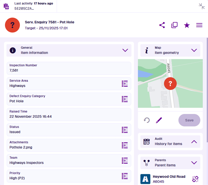
The item header displays its title and subtitle, along with various actions that you can perform. At the top, the Last activity field indicates when the item was last modified.
The item canvas is displayed below, which displays the item's data and relationships in multiple interactive sections.
Item actions
The following actions are available in the item header:
-
Copy link to item - copy the item's URL to your device's clipboard, so you can share it with other users in your company.
-
Clone item - create a copy of the item, with or without changes.
-
Add to favourites - add the item to your favourites for quick access. Select to remove the item from your favourites.
-
Item Menu:
- Switch view - for a different perspective, choose another view from the list (if available). This changes the order and visibility of the item's canvas sections.
-
Make template - convert the item into a reusable template, if allowed by its design.
-
Attach - link one or more uploaded files to the current item.
-
Archive - remove the item from active service, if allowed by its design.
-
Unarchive - restore the archived item to active service.
-
Delete - remove the item permanently.
-
Action availability depends on the current item. Items typically need to be archived before they can be deleted. You can only attach files to items whose design implements the Files Attachable interface.
At smaller widths, all actions appear within the Item Menu to save space.
Navigation
Items often have Link attributes that store references to other items. These are typically displayed in the General section (unless hidden by an item form). Select Data Explorer beside a Link attribute to open the set of items stored in that attribute.
By default, the contents of important Link attributes are displayed in separate sections on the item canvas, such as Defects, Jobs and Reports. The Parents section also displays other items with Link attributes that reference the current item! Select an item in these sections to view its details.
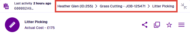
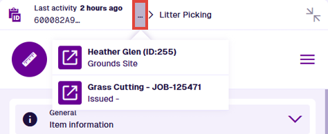
As you move from item to item, a breadcrumb trail appears above the item header to illustrate the path you've taken. Select any item along the path to return to it. Alternatively, use your browser's back button.
If the breadcrumb path gets too long, it shortens itself to save space. To return to a previous item that's hidden, select ... and choose it from the list.
Canvas sections
Item data is displayed across multiple sections on the item canvas. Each section displays a distinct set of data or a list of related items. Most are interactive and let you edit the data they display or perform a related action (if you have permission).
By default, all sections relevant to the current item are displayed.
However, one or more canvas views may be available for the item's design (or an interface it implements), which can display the item's data in different ways. These are either created by yourself or shared with you by other users. To switch to another canvas view, open the Item Menu in the item header and choose Switch view .
To hide the contents of a section, select the button in its header to collapse it.
To create canvas views with custom section layouts, see the Designer app.
📄️ General
View and edit item information
🗃️ Activities
Defects, Inspections, Jobs
📄️ Audit
Track every change
📄️ Comments
Post messages for other users to read
📄️ Gallery
Manage file attachments
📄️ Manual workflows
Trigger a workflow
📄️ Map
Visualise item location and geometry
📄️ Parents
Manage parent item links
📄️ Reports
View generated report items
📄️ Settings
View and override the item's properties