Details section
Configure properties and appearance
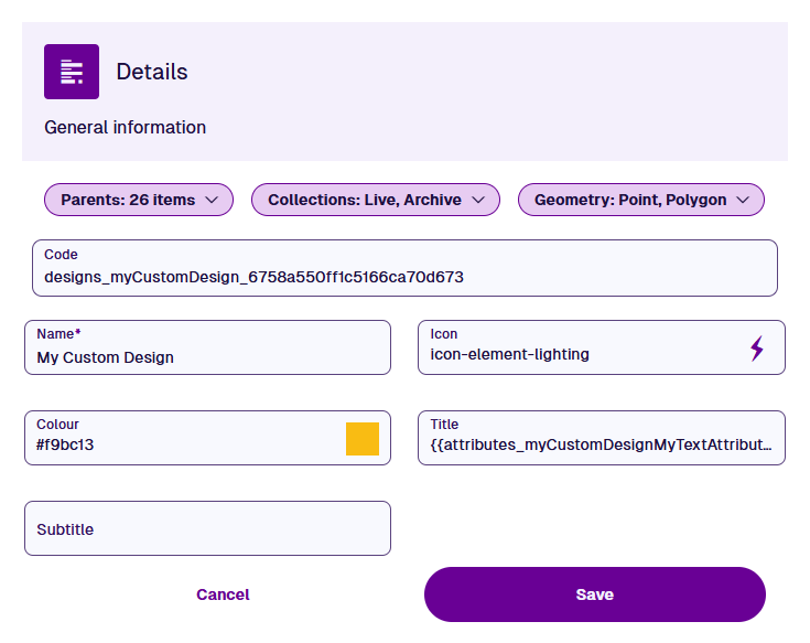
When editing a design/interface, the Details section displays its properties. Configure these to define its relationships, geometry requirements and visual appearance. Those marked with an asterisk * require a value to be set.
Dropdown details
The following properties appear as dropdown menus along the top of the section:
-
Parents - lists all designs/interfaces containing a Link attribute pointing to the current design/interface (or an interface it implements).
-
Implements (interfaces only) - lists all designs/interfaces that implement the current interface.
-
Applies to (activities only) - to be usable, an activity design must be applicable to one or more other designs. This makes it selectable when creating activities for items of those designs. If an interface is added to this list, the activity design will apply to all designs that implement it.
To add a design/interface to the list, select Add applies to. To remove one from the list, select its button.
For example
Imagine that you're editing a Graffiti Removal Jobs design. This type of job is performed on benches and bridges, so you add the Benches and Bridges designs to the list.
Similarly, this type of job is performed on playground equipment. Therefore, you add the Playground Assets interface to the list, which is implemented by multiple related designs (e.g. Swing Sets, Roundabouts, Slides).
-
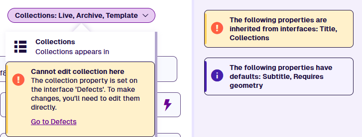
Collections - determines the collections that items of the current design (or designs implementing the current interface) can belong to. The default is Live and Archive.
- Set collection - if enabled, items will be limited to the selected collections.
- Geometry (*) - determines whether geometry is required on items of the current design (or designs implementing the current interface) and which geometry types can be stored. By default, geometry is optional and all types are allowed.
-
Set allowed geometry - if enabled, items will be limited to the selected geometry types. When populating an item's geometry, one of the allowed types can be supplied, e.g. Point or Line or Polygon.
-
If the Geometry Collection type is also allowed, one or more of the allowed types can be supplied, e.g. Point and Line and Polygon.
-
To prevent any geometry being set, leave this enabled without any types selected.
-
-
Requires geometry - if enabled, geometry must be supplied when creating or editing items. Geometry will not be inherited from parent items. Any existing items without geometry will require it when they're next edited.
-
Collections and Geometry can only be edited on designs/interfaces created by your organisation (Context = Customer).
General details
The following properties configure the design/interface and how it appears to users:
-
Code (read-only) - a unique identifier known as the Global Unique Code (GUC). Double-select to copy it to your device's clipboard.
-
Name * - enter a distinct name that clearly identifies the design/interface.
-
Description - describe what the design/interface represents. What data is stored? How is it intended to be used? This helps users and AI agents to understand its purpose.
-
Icon - use the icon picker to set the icon of the design/interface. The default is for designs and for interfaces.
-
Colour - use the colour picker to set the colour of the design/interface. The default is .
-
Title / Subtitle - templates that determine the primary and secondary text labels of corresponding items. To learn more, see Titles and subtitles.
-
AQS agent enabled - if disabled, the design/interface is excluded from AI agent queries.
Save changes
Select Save to finish or Cancel to discard your changes.
If a property is left blank, it may inherit a value from an interface or use a default value. If it's inherited, select the displayed Go to... link to edit the property on the interface it belongs to. To edit it in a new browser tab, use middle-click or Ctrl-click.