Edit the canvas view
Add/remove sections and configure their properties
After you create or open a canvas view, the Item Canvas Builder will appear. Use this tool to choose which data sections should be displayed on the canvas, adjust their size and layout, and configure their properties. Don't forget to select Save when you're done!
If you've opened a shared canvas view, you must be in its Editors list to save any changes to it!
What are canvas sections?
Each section displays a distinct set of data or a list of related items. Most are interactive and let you edit the data they display (if you have permission).
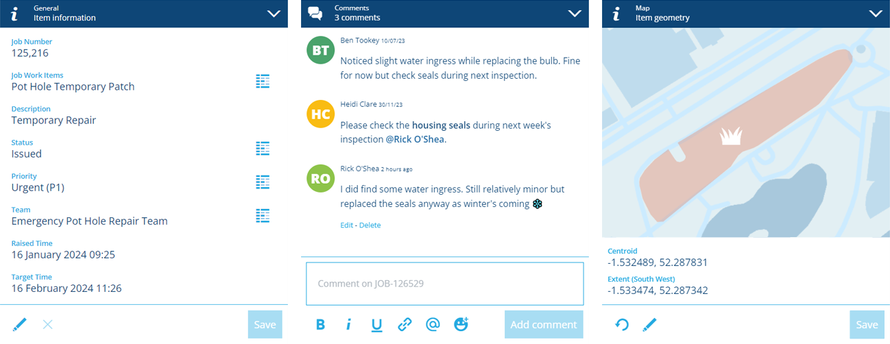
Canvas views have a grid layout, which helps them adapt to screen sizes of any shape or size. You can add any number of sections to the layout and drag them into the desired order. Main sections go in the left column and side sections go in the right column.
It's possible to have multiple canvas views for a particular design/interface, enabling you to tailor the number, size and position of canvas sections for different audiences, device types and more.
Using the Item Canvas Builder
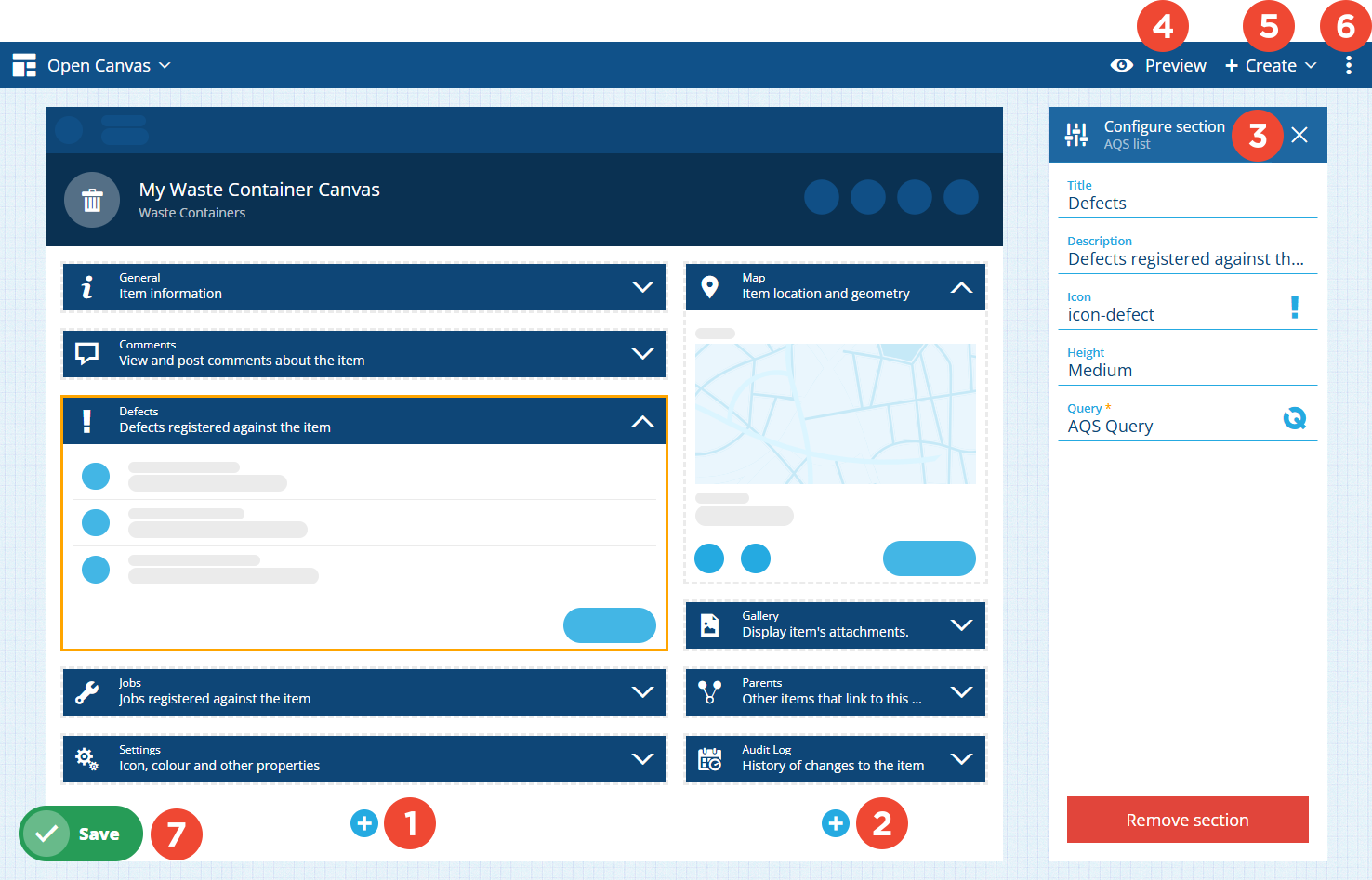
1 Main section column
To add a main section, select in the left column and choose a section type from the list. Drag sections to reorder them or move them between columns.
Main sections are wider. They span two-thirds of the canvas width and will be displayed first on mobile devices.
2 Side section column
To add a side section, select in the right column and choose a section type from the list. Drag sections to reorder them or move them between columns.
Side sections are narrower. They span one-third of the canvas width and are usually displayed alongside the main sections. However, on mobile devices where there isn't enough space, they'll be displayed beneath the last main section instead!
3 Configure section
Select a section to display its properties on the right. All sections have the following properties:
-
Title - customise the primary label of the section header.
-
Description - customise the secondary label of the section header.
-
Icon - customise the icon of the section header.
Use these to provide a clear explanation of the data or items displayed by the section. This is particularly important for AQS list sections with custom queries!

For other properties, see Canvas sections.
4 Preview
To try out the canvas view, select Preview in the app bar. After selecting an existing item to test with, you can see how the canvas looks at different screen sizes and interact with its sections.
To learn more, see Preview the canvas view
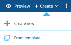
5 Create
To create a canvas view, select Create in the app bar. Choose whether to create a new canvas view from scratch or copy an existing template. You'll be prompted to save any changes to the current canvas view before continuing.
To learn more, see Create or open a canvas view.
6 Edit properties
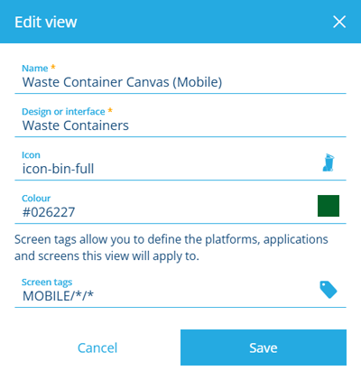
To edit the properties of the canvas view, open the Canvas Menu in the app bar and choose Edit . For other actions like sharing or deleting, see Canvas actions.
Details
Edit any of the following properties and then select Save finish:
-
Name * - enter a distinct name for the canvas view.
-
Design or interface * - choose the design/interface that the canvas view will apply to.
-
Icon - use the icon picker to change the canvas view's icon. By default, the icon of the chosen design/interface is used.
-
Colour - use the colour picker to change the canvas view's colour. By default, the colour of the chosen design/interface is used.
-
Screen tags - select at least one screen tag. These represent scenarios that the canvas view can be used in. If you like, you can create different canvas views for different use cases!
For example, you could have one canvas view that targets the Boards app (WEB/BOARDS/*), one that targets Alloy Mobile (MOBILE/ALLOYMOB/*), and one that targets Asset Classic (Application on web platform).
Custom tags
Select Add custom tag to define your own. Use the format
platform/application/screenas follows:-
platform- enterWEB,MOBILE(Android/iOS) or*for all. -
application- target an individual app, e.g.LISTS,BOARDS,ALLOYWEBor\*for all. -
screen- target a specific screen or process within an app, e.g.ActivitiesCreateTeam(The Create Teams process in Asset Classic) or * for all.
Alternatively, just select All platforms, applications and screens!
-
7 Save button
When you're finished, select Save in the bottom-left corner to save your changes. To leave without saving, select Designer in the top-left corner to return to the start screen.