Canvas sections
Manage the sections of a canvas view
When editing a canvas view, you can add any number of sections to the layout. Each type of section displays a set of data or a list of related items.
To add a main section, select Add at the bottom of the left column. To add a narrower side section, select Add in the right column. Choose an available section type from the list.
Drag sections around to reorder them and move them between columns. To remove a section, select it, then select Remove section at the bottom of its properties.
Common section types
Select a section to show its properties on the right. They determine the section's appearance and behaviour. Fields with an asterisk * are required.
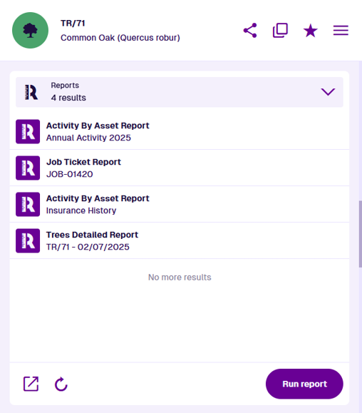
AQS list - display related items
Description
This section displays the item results of an AQS query, typically fetching items related to the one being viewed. Many of the default sections on items are actually AQS lists!
When adding an AQS list section to a canvas view, choose a ready-made query from the list, or select Custom query to build your own. Different queries are available depending on the design/interface targeted by the canvas view.
For example, if the canvas view targets any design/interface that implements the Items with Reports interface, you can choose the "Reports" query. It will fetch all generated report items that either involve the current item as a data source, or that were run directly from it. Due to their flexibility, multiple AQS list sections often appear on items by default. Their appearance varies depending on the related items being listed. To learn more, see:Sections that are AQS lists
Properties
When editing a canvas view, an AQS list section has the following properties:
-
Title - customise the primary label of the section header.
-
Description - customise the secondary label of the section header.
-
Icon - customise the icon of the section header.
-
Height - choose a fixed height for the section, regardless of its contents:
-
Small - display up to three lines without scrolling.
-
Medium (default) - display up to six lines without scrolling.
-
Large - display up to ten lines without scrolling.
-
-
Query * - edit the section's query. Use the AQS Builder to define one or more conditions that items must fulfil to be displayed in the section. To sort the listed items by an attribute or property, select the query root node.
Default AQS parameters
In this scenario, the AQS Builder provides two default parameters. A parameter is a placeholder that is substituted with a value when the query runs. If you include a parameter in your query, it becomes dynamic and can produce different results depending on the context:
-
currentItemId - represents the ID of the opened item. It can be used to fetch items related specifically to that item, e.g. activities, reports, attachments.
-
Current user ID - represents the ID of the user who has opened the item. It can be used to fetch items related specifically to that user.
To learn more, see AQS parameters.
-
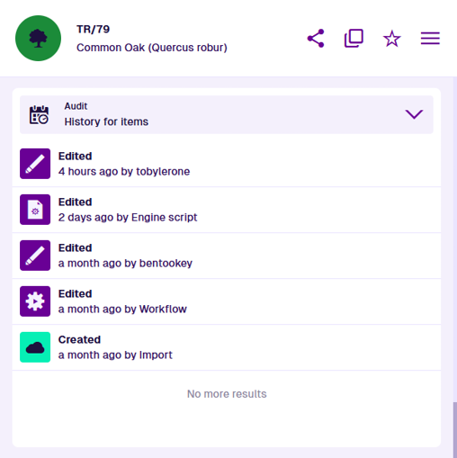
Audit - display the item's history of changes
Description
This section displays the editing history of the current item, including the full details of each change and who made it. By default, this section appears for items of all designs. To learn more, see the Audit section.
Properties
When editing a canvas view, an Audit section has the following properties:
-
Title - customise the primary label of the section header.
-
Description - customise the secondary label of the section header.
-
Icon - customise the icon of the section header.
-
Height - choose a fixed height for the section, regardless of its contents:
-
Small - display up to three lines without scrolling.
-
Medium (default) - display up to six lines without scrolling.
-
Large - display up to ten lines without scrolling.
-
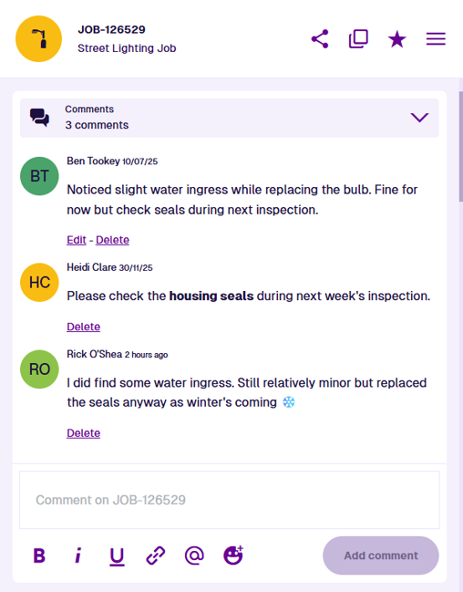
Comments - post messages for other users to read
Description
This section displays formatted comments about the current item and lets you post your own. Comments can include links to other items, URLs and emojis! By default, this section appears for items of all designs. To learn more, see the Comments section.
Properties
When editing a canvas view, a Comments section has the following properties:
-
Title - customise the primary label of the section header.
-
Description - customise the secondary label of the section header.
-
Icon - customise the icon of the section header.
-
Height - choose a fixed height for the section, regardless of its contents:
-
Small - display up to three lines without scrolling.
-
Medium (default) - display up to six lines without scrolling.
-
Large - display up to ten lines without scrolling.
-
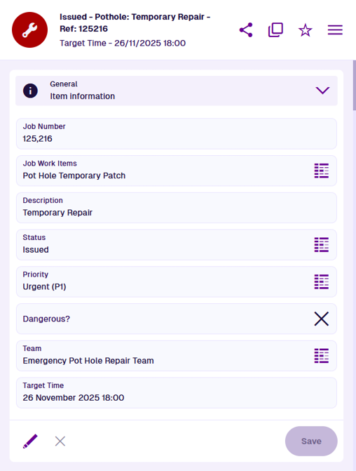
General - view and edit item attributes
Description
This section displays the current item's attributes (as defined by its design), with the ability to edit any values stored for each attribute. By default, this section appears for items of all designs. To learn more, see the General section.
Properties
When editing a canvas view, a General section has the following properties:
-
Title - customise the primary label of the section header.
-
Description - customise the secondary label of the section header.
-
Icon - customise the icon of the section header.
-
Minimum/Maximum Height - limit the section's height. It will be the minimum by default. If you specify a maximum, it will be that height if there are more lines to display:
-
Small - display up to three lines without scrolling.
-
Medium (default) - display up to six lines without scrolling.
-
Large - display up to ten lines without scrolling.
-
Dynamic - the section's height will automatically match the number of lines, so everything can be displayed without scrolling. This could make it very short or very tall!
-
- Default mode * - choose one of the following:
-
View (default) - initially display the section in read-only mode. The order and visibility of attributes is defined by a corresponding item form (if one exists with Applies to view enabled) or by the design's stencil. By default, all attributes appear in the order they were added.
-
Edit - initially display the section in edit mode. The order and visibility of attributes is defined by a corresponding item form (if one exists with Applies to edit enabled). If no item form exists for the item's design, all attributes appear in the order they were added.
-
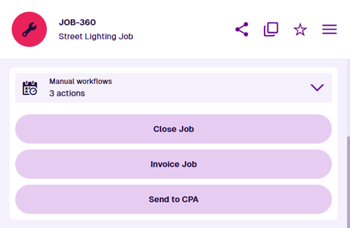
Manual workflows - display trigger buttons for specific workflows
Description
This section displays buttons for workflows that can be triggered against the current item. To learn more, see the Manual workflows section.
Properties
When editing a canvas view, a Manual workflows section has the following properties:
-
Title - customise the primary label of the section header.
-
Description - customise the secondary label of the section header.
-
Icon - customise the icon of the section header.
-
Minimum/Maximum Height - limit the section's height. It will be the minimum by default. If you specify a maximum, it will be that height if there are more lines to display:
-
Small - display up to three lines without scrolling.
-
Medium (default) - display up to six lines without scrolling.
-
Large - display up to ten lines without scrolling.
-
Dynamic - the section's height will automatically match the number of lines, so everything can be displayed without scrolling. This could make it very short or very tall!
-
To add a trigger button to the section, select Add trigger and fill in the following fields:
-
Workflow * - choose from a list of manual workflows that are compatible with the design/interface that the canvas view applies to.
-
Name * - enter a distinct button label that describes what the workflow does.
-
Icon - use the icon picker to add an icon to the button label.
-
Colour - use the colour picker to change the colour of the button. by default.
To remove a trigger button, select its Remove button.
Map - display item location and geometry
Description
This section displays the current item's location on a mini map, with the ability to expand to full screen and edit the item's geometry coordinates. By default, this section appears for items of all designs, unless they're configured to prevent all geometry types (see the Details section in the Designer app). To learn more, see the Map section.
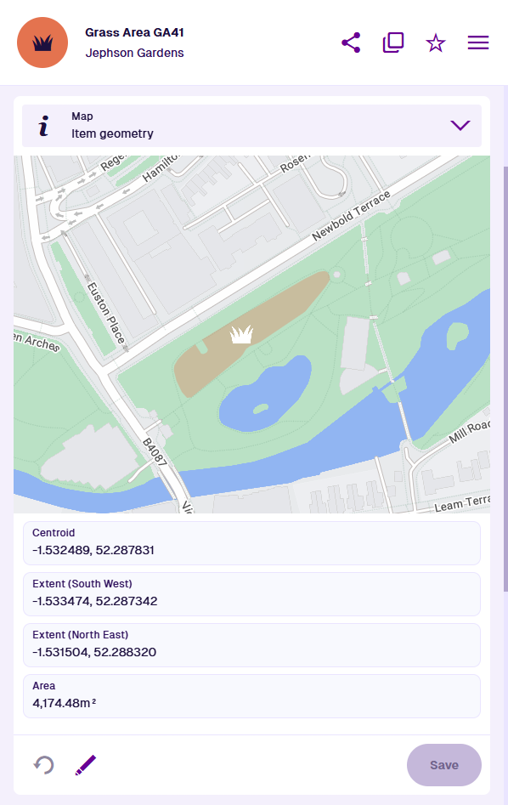
Properties
When editing a canvas view, a Map section has the following properties:
-
Title - customise the primary label of the section header.
-
Description - customise the secondary label of the section header.
-
Icon - customise the icon of the section header.
-
GeoJson attribute code * - by default, the item's standard Geometry attribute is used. To visualise another Geometry attribute on the item instead, choose it here.
-
Show information - if enabled, the centroid, extents and area of the item's geometry will be calculated and displayed beneath the map.
-
Layers - to display other sets of items on the map, select one or more layers from the list.
-
Basemap - to specify the background imagery of the map, choose a basemap from the list. This ensures it will look the same to all users. If left blank, the user's active basemap will be used.
Parents - display items that link to the current one
Description
This section displays parent items, which store references to the current item in one of their Link attributes. Remove existing parent links and add new ones as needed. By default, this section appears for items of all designs. To learn more, see the Parents section.
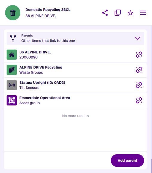
Properties
When editing a canvas view, a Parents section has the following properties:
-
Title - customise the primary label of the section header.
-
Description - customise the secondary label of the section header.
-
Icon - customise the icon of the section header.
-
Height - choose a fixed height for the section, regardless of its contents:
-
Small - display up to three lines without scrolling.
-
Medium (default) - display up to six lines without scrolling.
-
Large - display up to ten lines without scrolling.
-
-
Filter by attribute - only display parent items that link to the current item through the chosen Link attribute. If that attribute is on an interface, the filtered parent items may be of different designs.
-
Filter by graph code - only display parent items that link to the current item through Link attributes that use the chosen item graph type. To learn more, see Link attribute.
Settings - display and override item properties
Description
This section displays the current item's properties, such as its design and context. Some can be overridden, including its icon and colour. To learn more, see the Settings section.
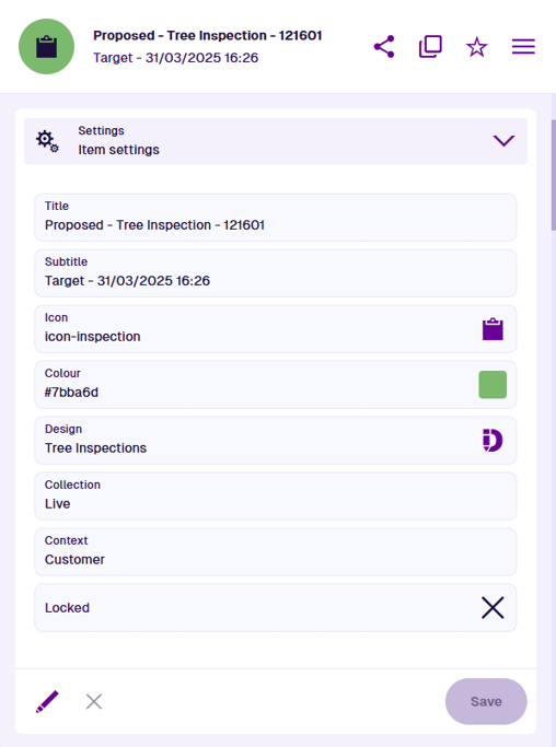
Properties
When editing a canvas view, a Settings section has the following properties:
-
Title - customise the primary label of the section header.
-
Description - customise the secondary label of the section header.
-
Icon - customise the icon of the section header.
-
Minimum/Maximum Height - limit the section's height. It will be the minimum by default. If you specify a maximum, it will be that height if there are more lines to display:
-
Small - display up to three lines without scrolling.
-
Medium (default) - display up to six lines without scrolling.
-
Large - display up to ten lines without scrolling.
-
Dynamic - the section's height will automatically match the number of lines, so everything can be displayed without scrolling. This could make it very short or very tall!
-
- Default mode * - choose one of the following:
-
Edit - initially display the section in edit mode.
-
Info (default) - initially display the section in read-only mode.
-
Other section types
The availability of these sections depends on the configuration of the item's design.
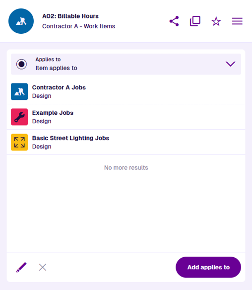
Applies to - manage the applicable job types of a work item
Description
This section lets you manage the job designs and job interfaces that the current work item applies to. This defines which job types the work item can be added to. This section is only available for items of the Work Units and Work Items interfaces. To learn more, see the Applies To section.
Properties
When editing a canvas view, an Applies to section has the following properties:
-
Title - customise the primary label of the section header.
-
Description - customise the secondary label of the section header.
-
Icon - customise the icon of the section header.
-
Height - choose a fixed height for the section, regardless of its contents:
-
Small - display up to three lines without scrolling.
-
Medium (default) - display up to six lines without scrolling.
-
Large - display up to ten lines without scrolling.
-
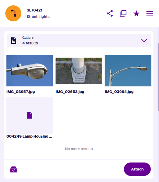
Gallery - manage item attachments
Description
This section lets you manage the file attachments of the current item. It includes the ability to preview images, download files and add new attachments. This section is only available for designs that implement the Files Attachable interface. To learn more, see the Gallery section.
Properties
When editing a canvas view, a Gallery section has the following properties:
-
Title - customise the primary label of the section header.
-
Description - customise the secondary label of the section header.
-
Icon - customise the icon of the section header.
-
Height - choose a fixed height for the section, regardless of its contents:
-
Small - display up to three lines without scrolling.
-
Medium (default) - display up to six lines without scrolling.
-
Large - display up to ten lines without scrolling.
-
-
Query * - edit the section's query. By default, it fetches items of the Files interface that have the current item as a parent. In other words, the files in the current item's Attachments attribute!
Use the AQS Builder to define one or more conditions that those items must fulfil to be displayed in the section. To sort the listed items by an attribute or property, select the query root node.
Default AQS parameters
In this scenario, the AQS Builder provides two default parameters. A parameter is a placeholder that is substituted with a value when the query runs. If you include a parameter in your query, it becomes dynamic and can produce different results depending on the context:
-
currentItemId - represents the ID of the opened item. It can be used to fetch items related specifically to that item, e.g. activities, reports, attachments.
-
Current user ID - represents the ID of the user who has opened the item. It can be used to fetch items related specifically to that user.
To learn more, see AQS parameters.
-
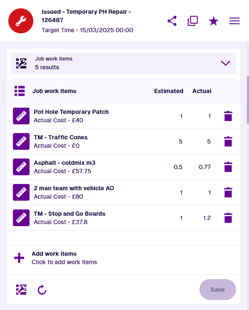
Job work items - manage the individual work units of a job item
Description
This section lets you manage the job work items of the current job. It includes the ability to add and remove work items, and specify their quantities. This section is only available for designs that implement the Jobs interface. To learn more, see the Job work items section.
Properties
When editing a canvas view, a Job work items section has the following properties:
-
Title - customise the primary label of the section header.
-
Description - customise the secondary label of the section header.
-
Icon - customise the icon of the section header.
-
Height - choose a fixed height for the section, regardless of its contents:
-
Small - display up to three lines without scrolling.
-
Medium (default) - display up to six lines without scrolling.
-
Large - display up to ten lines without scrolling.
-
- Show costs - if enabled and the Description is left blank, the total estimated/actual job cost will be displayed in the section header.
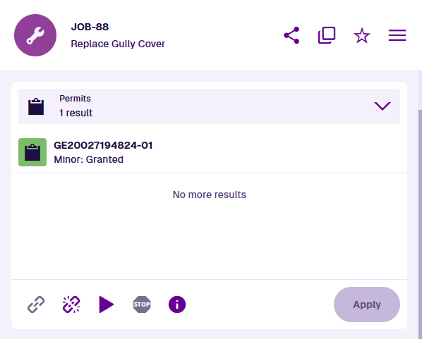
Permits - manage the permit status of a job item
Description
This section lets you manage the permit of the current job, if one is required. It includes the ability to apply for a new permit, check permit status, and log when the works start/stop. This section is only available for designs that implement the Street Manager Works Reference Assignable interface. To learn more, see the Permits section.
Properties
When editing a canvas view, a Permits section has the following properties:
-
Title - customise the primary label of the section header.
-
Description - customise the secondary label of the section header.
-
Icon - customise the icon of the section header.
-
Height - choose a fixed height for the section, regardless of its contents:
-
Small - display up to three lines without scrolling.
-
Medium (default) - display up to six lines without scrolling.
-
Large - display up to ten lines without scrolling.
-