Edit the item form
Configure attribute fields and expressions
After you create or open an item form, the Item Form Builder will appear. Use this tool to add controls to the item form's layout and configure their properties. Don't forget to select Save when you're done!
What are controls?
Controls are the building blocks of your item form. They represent the data fields that will appear on the form. There are three types of control:
-
Attribute controls - input fields for setting the value of attributes on the item being created/edited.
-
Label controls - read-only data fields for displaying static or generated values.
-
Layout controls - cosmetic elements to give your item form structure.
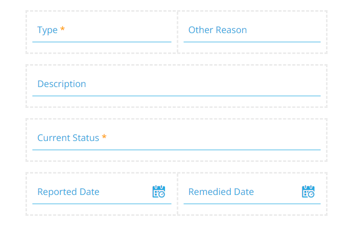
Item forms have a grid layout, which helps them adapt to screen sizes of any shape or size. New controls occupy a new row in the grid. You can then resize them and drag them into different places. Up to six minimum-width controls can fit on a single row.
Using the Item Form Builder
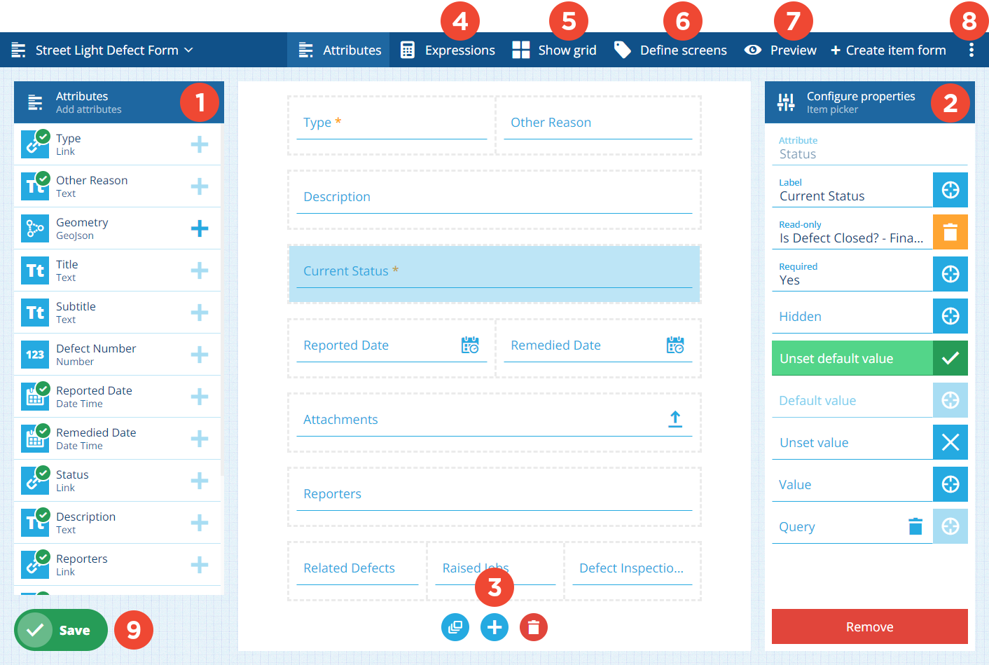
1 Attributes
When the Item Form Builder opens, the attributes of the corresponding design/interface are listed on the left. A green tick indicates that an attribute is referenced by the item form in some way.
Each attribute can be represented by one control on the item form. To add an attribute to the form, select its button and choose the most suitable control type for your needs.
To learn more, see Attribute controls.
2 Configure properties
Select a control to display its properties on the left. Depending on the control type, these determine the control's appearance, behaviour and initial value.
Properties can be set dynamically, based on the output of a computed expression. To make a property target an expression, select its button and choose from a list of compatible expressions (their Final node output matches the property type).
For full details, see Attribute controls and Other controls.
3 Layout buttons
These appear at the bottom of the item form:
-
Add all default controls - populate the item form with controls for all available attributes. The default control type is used for each attribute type (e.g. a Text input control is used for a Text attribute).
-
Add control - add other controls to the item form.
-
Clear controls - remove all controls from the item form.
4 Expressions
To manage the item form's expressions, select Expressions . This is a powerful feature you can use to make your item forms dynamic and reactive to user input.
An expression is a sequence of values and functions that outputs a final value. Using our handy builder, you can create an expression that reads and reacts to the properties of any control on the form (or a variable like the current time).
If you make a control property target an expression, it will be set according to the expression's output, which can change depending on how the item form is used (e.g. a control becomes required if another control is populated).
To learn more, see Item form expressions.
5 Show grid
To show a faint grid overlay on the item form, select Show grid in the app bar. This can be helpful when resizing controls and moving them between rows. Select Hide grid to remove the overlay.
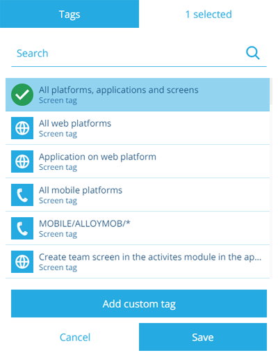
6 Define screens
To see the item form's screen tags, select Define screens in the app bar. These represent scenarios that the item form can be used in. If you like, you can create different item forms for different use cases!
For example, you could have one item form that targets the Boards app (WEB/BOARDS/*), one that targets Alloy Mobile (MOBILE/ALLOYMOB/*), and one that targets Asset Classic (Application on web platform).
Custom tags
Select Add custom tag to define your own. Use the format platform/application/screen as follows:
-
platform- enterWEB,MOBILE(Android/iOS) or*for all. -
application- target an individual app, e.g.LISTS,BOARDS,ALLOYWEBor\*for all. -
screen- target a specific screen or process within an app, e.g.ActivitiesCreateTeam(The Create Teams process in Asset Classic) or * for all.
Alternatively, just select All platforms, applications and screens!
To easily remove tags, select the top-right corner of the window (that says X selected). You can then remove individual tags by selecting their button or select Remove all to clear the list.
7 Preview
To try out the item form, select Preview in the app bar. After selecting an existing item to test with, you can see how the item form looks at different screen sizes and interact with its controls.
To learn more, see Preview the item form.
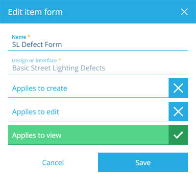
8 Edit properties
To edit the properties of the item form, open the Item Form Menu in the app bar and choose Edit . For other actions, see Item form actions.
Details
-
Name - enter a distinct name for the item form.
-
Design or interface - the design/interface the item form applies to.This can't be changed after creation! -
Applies to create - display the item form when creating an item of the chosen design/interface.
-
Applies to edit - display the item form when editing an item of the chosen design/interface.
-
Applies to view - display the item form when viewing an item of the chosen design/interface.
9 Save button
When you're finished, select Save in the bottom-left corner to save your changes. To leave without saving, select Designer in the top-left corner to return to the start screen.