Attribute controls
Configure the attributes on the item form
When editing an item form, select Attributes in the app bar to manage its attribute controls.
The attributes of the corresponding design/interface are listed on the left. A green tick indicates that an attribute is referenced by the item form in some way. Select it to flash the location of its use in the form.
For each attribute, you can add one control to the item form, to serve as an input field for that attribute. Depending on the attribute type, there may be several control types to choose from.
An orange warning will appear if the item form is missing controls for required attributes!
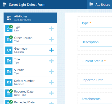
While an attribute can only have one control, you can add multiple label controls that reference the same attribute.
Add attribute controls
To add an attribute to the item form, select its Add button, then choose a suitable control type. Each one provides a different way for data to be entered and viewed, e.g. for a Text attribute, you might choose a standard Text input control or a Multiline text input control.
If an attribute's button is dimmed, the item form already has a control for it (select to flash its location). Generated attributes can't be added to the form, e.g. Title, Subtitle and Defect/Inspection/Job Number.
To quickly add all attributes, select Add all default controls at the bottom. For each attribute, the default control type for that attribute type will be added to the form.
Control types
When adding an attribute, only the compatible control types for that attribute type are listed.
For Text attributes
| Control Type | Attribute Type | Description | Preview (select to zoom) | Alloy Mobile |
|---|---|---|---|---|
| Collection code picker | Text | Users can pick a collection to store as text. | 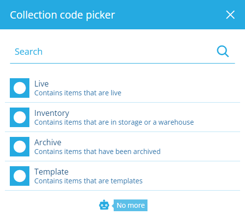 | As a Text input |
| Colour picker | Text | Users can pick a colour to store as text (hex code). | 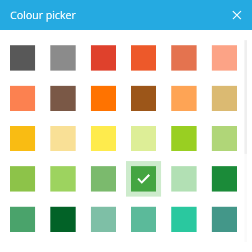 | As a Text input |
| Design or interface picker | Text | Users can pick a design or interface to store as text (Guc code). | 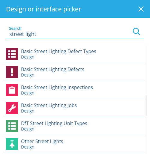 | As a Text input |
| Feature picker | Text | Users can pick an Asset Management feature to store as text (Guc code). | 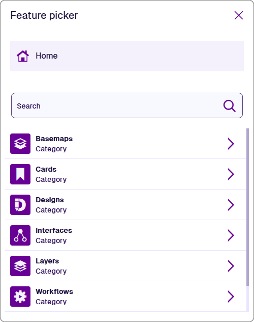 | As a Text input |
| Icon code picker | Text | Users can pick a Causeway icon to store as text (icon code). | 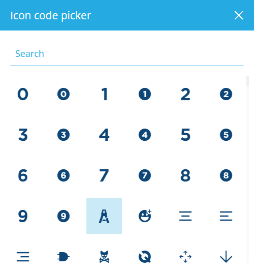 | As a Text input |
| Mesh picker | Text | Users can pick a Mesh item to store as text (Guc code). | 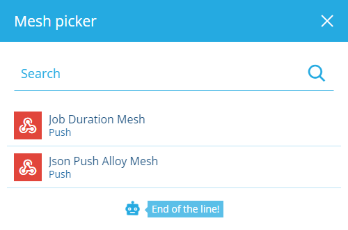 | As a Text input |
| Multiline text input | Text | Users can type text with line breaks into a large box. | 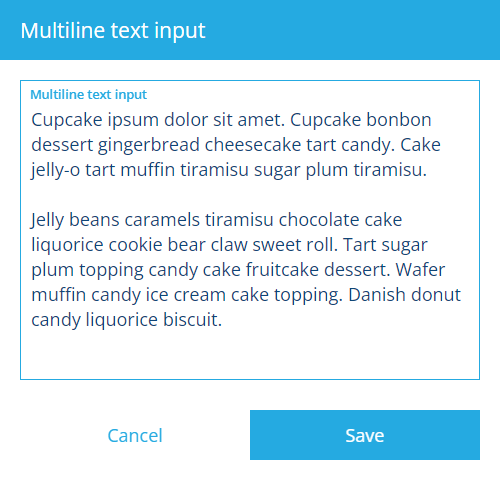 | As a Text input |
| Text input | Text | Users can type text into a single line field. |  |
For other attributes
| Control Type | Attribute Type | Description | Preview (select to zoom) | Alloy Mobile |
|---|---|---|---|---|
| AQS editor | AQS | Users can build and submit a query with the AQS Builder. | 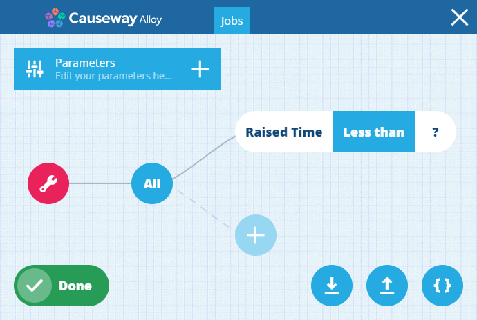 | |
| Checkbox | Yes/No | Users can toggle the attribute between true and false. |  | |
| Date picker | Date | Users can pick a date with the calendar picker. |  | |
| Date time picker | Date Time | Users can pick a date and time with the calendar picker. |  | |
| File picker | Link | Users can pick a file stored in CausewayOne Asset Management or upload one directly. | 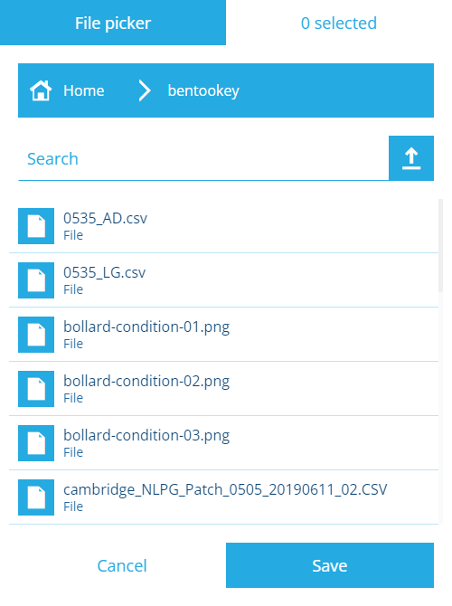 | |
| Geometry editor | Geometry | Users can draw points, lines or polygons with the Geometry Editor. | 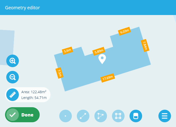 | |
| Item picker | Link | Users can pick items from the attribute's lookup list with the item picker. | 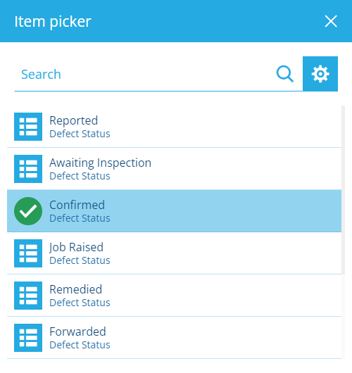 | |
| JSON picker | Json | Users can input JSON code. | 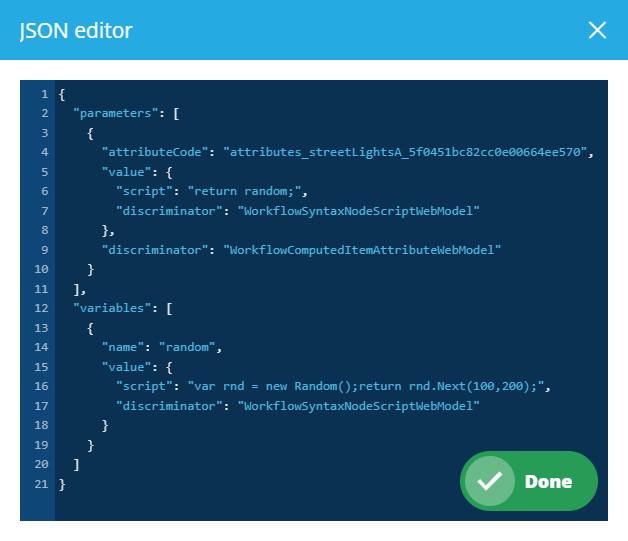 | |
| JSON form editor | Json | Users can input or choose values for each property defined by the attribute's schema. | 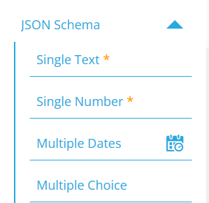 | |
| Number input | Number | Users can type a number into the field. |  | |
| Seasonal picker | Seasonal | Users can pick a day of the year with the calendar picker. | 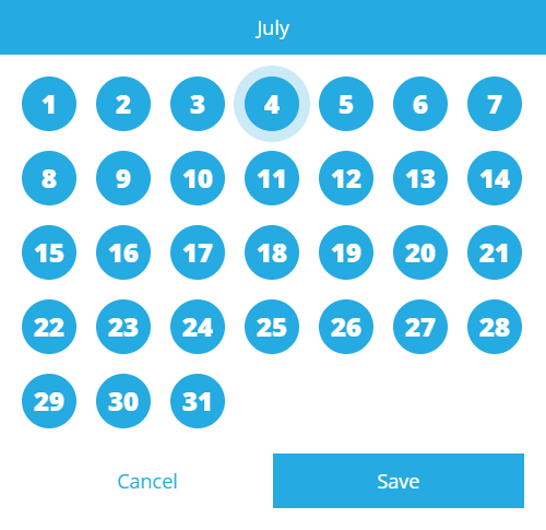 | |
| Time picker | Time | Users can pick a time with the calendar picker. | 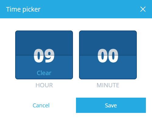 |
Control properties
Every attribute control has a set of properties that determine its appearance, behaviour and initial value. They vary depending on the control type but all are explained below!
For advanced customisation, control properties can be set dynamically, based on the output of an expression. To do this, select the property's Target button.
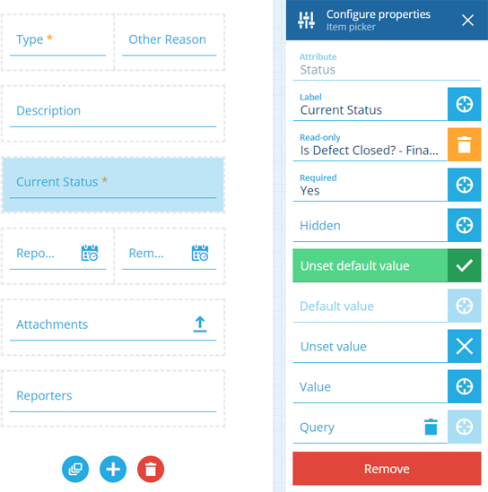
Select a control to configure its properties:
-
Label - set a display name for the control. Otherwise, the attribute's name will be used.
-
Read-only - the control won't be editable. It can only be populated with a default value (set by the control or the attribute itself).
-
Required - the control must have a value set. It won't be possible to leave it blank!
-
Hidden - the control won't be visible. However, it can still be populated by a default value (set by the control or the attribute itself), or the output of a targeted expression.
If the attribute itself is Read-only or Required by the item's design/interface, this can't be overridden by an item form. You can make a writeable attribute read-only, or an optional attribute required, but not vice versa!
-
Unset default value - if the attribute itself has a default value (defined by the item's design/interface), it will be ignored.
or
-
Default value - the control will automatically be populated with this, unless another value is set (by a user or a targeted expression). If the attribute itself has a default value, this will override it.
-
Unset Value - clears the current value when triggered by a targeted expression. If set here, the control is guaranteed to be empty initially.
or
-
Value - the control will initially be populated with this (overriding any default value). But unlike a default value, the control won't be repopulated with this if left blank.
-
Query - this only appears for Link attributes. It lets you customise the attribute's lookup list on the form. Use the AQS Builder to define one or more conditions that items must fulfil to be included in the list. To sort the listed items by an attribute or property, select the query root node.
Default AQS parameters
In this scenario, the AQS Builder provides two default parameters. A parameter is a placeholder that is substituted with a value when the query runs. If you include a parameter in your query, it becomes dynamic and can produce different results depending on the context:
-
Current item ID - represents the ID of the item being viewed or edited. It can be used to fetch items related specifically to that item, enabling fields on the form to display context-sensitive lookup results.
-
Current user ID - represents the ID of the user who is creating, editing or viewing the item. It can be used to fetch items related specifically to that user.
To learn more, see AQS parameters.
-
Remove controls
To remove a control, select it, and then select Remove at the bottom of its Configure properties section.
To remove all controls from the item form, select Clear controls at the bottom.