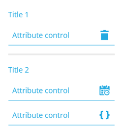
Other controls
Configure other controls on the item form
When editing an item form, there are other control types that you can add to the form, in addition to attribute controls.
To do this, select Add control at the bottom and choose one of the following control types from the list. Select the added control to configure its properties on the right.
Layout controls
These controls are cosmetic and useful for structuring your item form:
-
Separator - break up your item form into sections.
-
Title - label the sections in your item form.
Both have a Hidden property. If enabled, the control won't be visible when the item form is used.
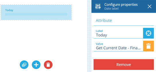
Label controls
Use label controls to display read-only data in your item form. Unlike attribute controls, their values are not submitted when the item form is saved. It's all just for show!
All label controls have the following properties:
-
Attribute - display the value of a compatible item attribute.
or
-
Value - display a static value entered by you. Alternatively, select Target to display a dynamic value from a targeted expression.
- Label - set a display name for the control. If left blank, the attribute's name will be used (if set).
Some label controls have extra properties that affect how data is displayed. If a label control has nothing to display, it will appear empty when creating/editing items and be hidden when viewing items.
Control types
| Control Type | Description | Extra Properties | Example Value |
|---|---|---|---|
| AQS label | Display an AQS query as code. Double-click to copy it to your device's clipboard. Select to view the query in the AQS Builder. | {"type":"Query","properties":{"attributes":["attributes_itemsTitle"... | |
| AQS results label | Display the first item result of an AQS query. Select to view the full results in the Data Explorer app. | Display - set to Count to show the number of results instead. | DEF-1287 or 24 items |
| Checkbox label | Display a Yes/No (boolean) value. | or | |
| Colour label | Display a hexadecimal colour code and a sample square. | #1ce1ce | |
| Date label | Display a date value. | 2 July 2026 | |
| Date time label | Display a date time value. | Precision - set to Minutes, Seconds or Milliseconds. | 2 July 2026 16:20:00 |
| Design or interface label | Display the name of a design or interface. Select to open it in the Designer app. | Attribute - choose one that stores a Guc code, e.g. designs_streetLights. | Street Lights |
| Geometry label | Display geometry in a map thumbnail. Select it to open the area in the Geometry Editor. | 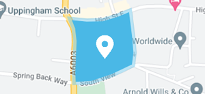 | |
| Geometry street view | Display a photo of the geometry's location. Select it to open the location in Google Street View. | 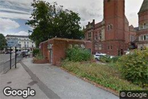 | |
| Icon code label | Display an icon code and the rendered icon. | icon-element-fire | |
| Item label | Display one or more items. Select to view them in the Data Explorer app. | Design or interface - set this to filter the available items. | SL/3088 or 128 items |
| Json form label | Display a dropdown list of JSON data values. | Attribute - choose one that has schema. or Value - populate this with JSON code and set a Schema that defines its structure. | 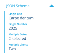 |
| Number label | Display a numerical value. | Currency - set this to display the number in your local currency. Format - see Text and Number Formatting. | 12.9 or £12.90 |
| Text label | Display a text value. | Format - see Text and Number Formatting. | I love Causeway |
| Text URL label | Display a hyperlink that opens in a new browser tab. | 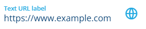 | |
| Time label | Display a time value. | Precision - set to Minutes, Seconds or Milliseconds. | 16:20:00 |
Remove controls
To remove a control, select it, and then select Remove at the bottom of its Configure properties section.
To remove all controls from the item form, select Clear controls at the bottom.