Create an item
Store a set of attribute values
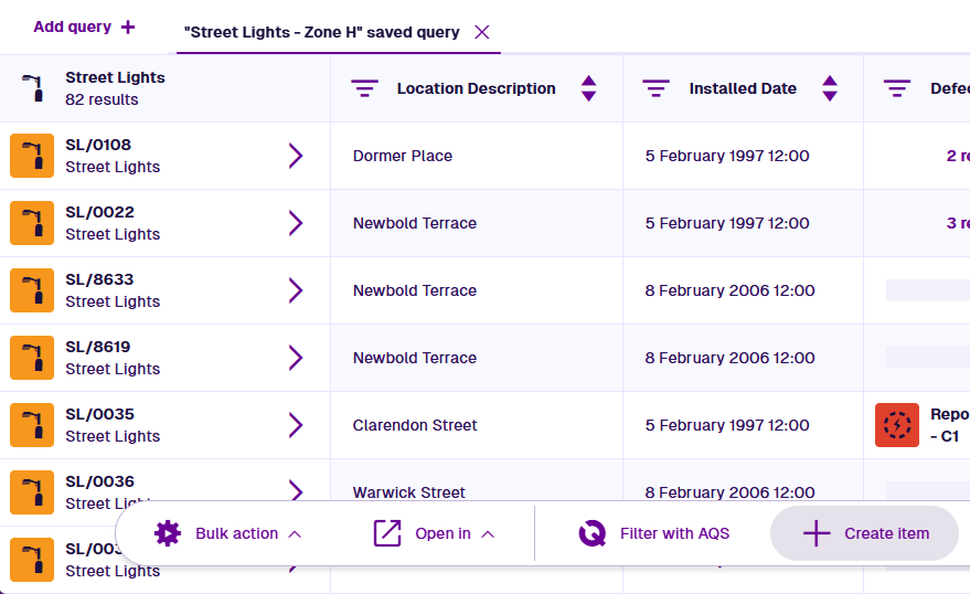
After creating a query in the Data Explorer app, the item results and their attributes are displayed as a table. To store a new row of attribute values for that table, select Create item in the bottom toolbar. If the button is hidden, open the Overflow Menu.
Depending on the current query, this lets you:
-
create an item of the targeted design, or
-
create an item of a design implementing the targeted interface
Afterwards, select Refresh data in the bottom toolbar to update the query tab.
Alternatively, use a bulk action to create several activity items at once, against multiple selected items.
The Create Item process
Select a step to show its settings. Some fields are populated automatically, depending on where you started from, e.g. starting from the Designer app automatically selects the design you have open.
To proceed, complete all required steps and fields marked with an asterisk *.
1 Select a design
Fill in these fields:
-
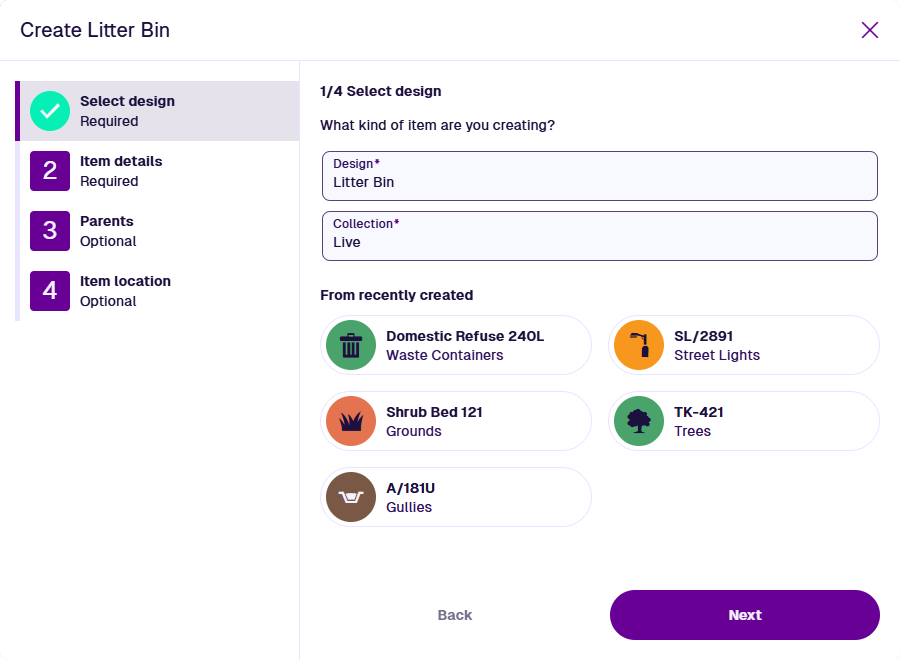
Design * - select the design of the new item. This determines the next steps: the attributes you can fill in, the parents you can link, and the geometry you can set.
The available designs depend on where you started from. If you were working with an interface, only designs that implement the interface are listed.
-
Collection * - select the collection the new item will belong to (usually Live by default). The selected design determines which are available. If set to Template, required attributes can be left blank on the new template item.
Alternatively, choose an item under From recently created to reuse its configuration. The new item will use the same design, collection, attribute values and geometry by default (but not parents). You can change any of these before selecting Create.
2 Item details
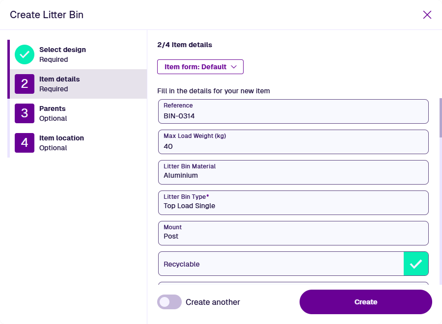
By default, item attributes are displayed in the order they were added to the selected design. Read-only and calculated attributes (e.g. Job Number) are hidden.
Alternatively, the layout and visibility of attributes are determined by an item form, which can also show read-only data. If any item forms exist for the selected design, the most suitable one is used. To use another, select the Item form button.
Some attributes may be populated with a default value. Required attributes are marked with an asterisk * and must have a value to continue. The only exception is creating a template item (those attributes will be required when creating a new item from it).
Select an attribute field to edit its value. Depending on the attribute type, enter a value directly into the field, or use the specialised picker to choose one or more values.
Attribute types
| Icon | Type | Description | Input Method |
|---|---|---|---|
| AQS | Store an AQS query in JSON format | Build a query in the AQS Builder | |
| Date | Store a date value, e.g. 30 April 2024 | Select a value with the calendar picker | |
| Date Time | Store a date and time value, e.g. 2 July 2025 13:30:00 | Select a value with the calendar picker | |
| Geometry | Store geometry coordinates in GeoJSON format | Draw points, lines or polygons using the Geometry Editor | |
| JSON | Store JSON code | Type into a fullscreen JSON Editor | |
| Link | Store the IDs of items of a specific design/interface | Select one or more items with the item picker or map picker | |
| Number | Store a number value, e.g. 256, 3.1415 | Type directly into the field | |
| Seasonal | Store a date without a year, e.g. 25th December | Select a value with the calendar picker | |
| Text | Store a text value, e.g. I love managing my assets with Causeway | Type directly into the field | |
| Time | Store a time value e.g. 14:20:55 | Select a value with the calendar picker | |
| Yes/No | Store a boolean value, e.g. true or false | Toggle the field to enable or disable it |
If the item form includes any attributes covered by other steps (e.g. Geometry), their controls are read-only. This stops you accidentally setting two values and shows if the attribute has a default value.
3 Parents
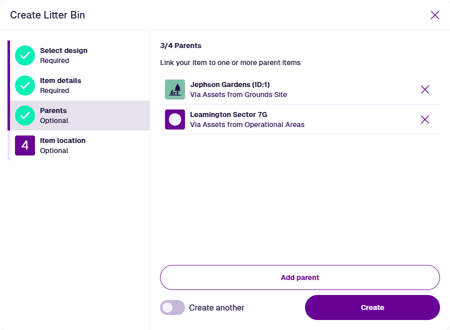
You can link the new item to any number of parent items. This works by adding the new item to a compatible Link attribute on the parent.
For example, you're creating a bin item. It's located at the Jephson Gardens site. The Grounds Site design has a Link attribute pointing to the Assets interface, which is implemented by the Litter Bin design. Therefore, you can add a parent-to-child relationship from the site item to the bin item, via that attribute.
Select Add parent and fill in these fields:
-
Design * - choose from the list of designs containing a compatible Link attribute.
-
Attribute * - choose a Link attribute on the design.
-
Item * - choose an item of the design to be the parent, using the item picker or map picker.
Select Add to finish.
If you start the process from an existing item, that item is automatically added as a parent, e.g. creating a job from an asset.
Select an existing parent to edit its relationship. To remove a parent, select its Remove button.
When creating an activity, if you add another activity as a parent, its parent asset will automatically be added as a second parent.
For example, you're creating a job to resolve a defect. If you add the defect as a parent, the new job will automatically get the defect's asset as another parent.
4 Item location
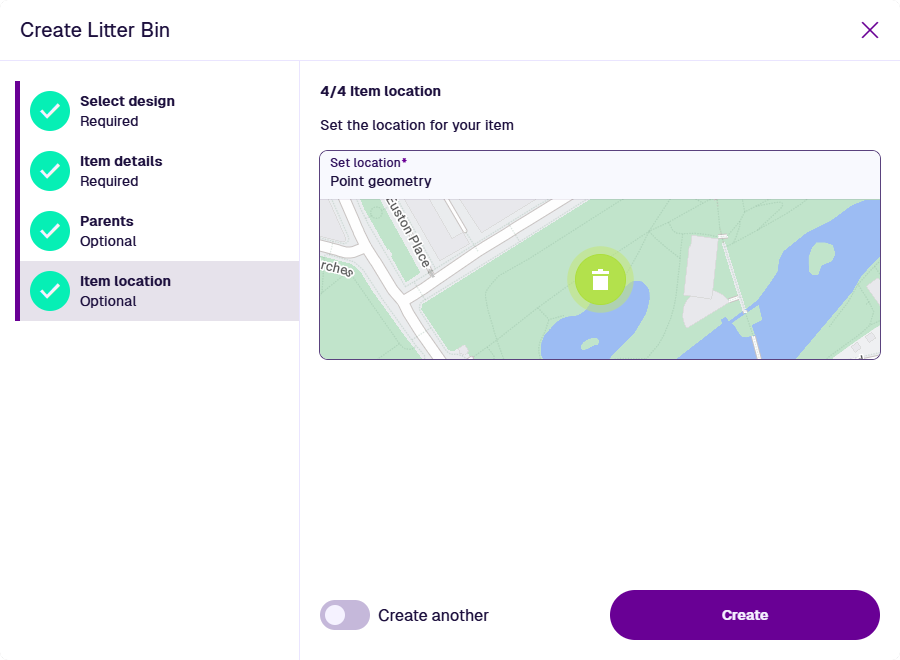
To set the new item's geometry, select Set location. Use the Geometry Editor to draw the geometry on the map or supply coordinates. This may be a point, line or polygon, depending on what the selected design allows.
If the field has an asterisk *, the selected design (or an interface it implements) has the Requires geometry property enabled. Therefore, a value must be supplied, unless Collection is set to Template or Inventory.
When creating an activity, if you leave this step blank, the activity will automatically inherit the geometry of its parent.
Finish the process
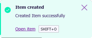
After completing the relevant steps for your item, select Create to finish. A notification indicates whether the item was created successfully or failed due to an error.
The new item's details are displayed. To open the item in a new browser tab, select Open item in the notification. Every setting you've configured can be changed later, except for the item's design.