Navigation
Find your way around
Asset Management is an application on the CausewayOne platform. It shares the same style and layout as other CausewayOne applications. The user interface has the following key areas.
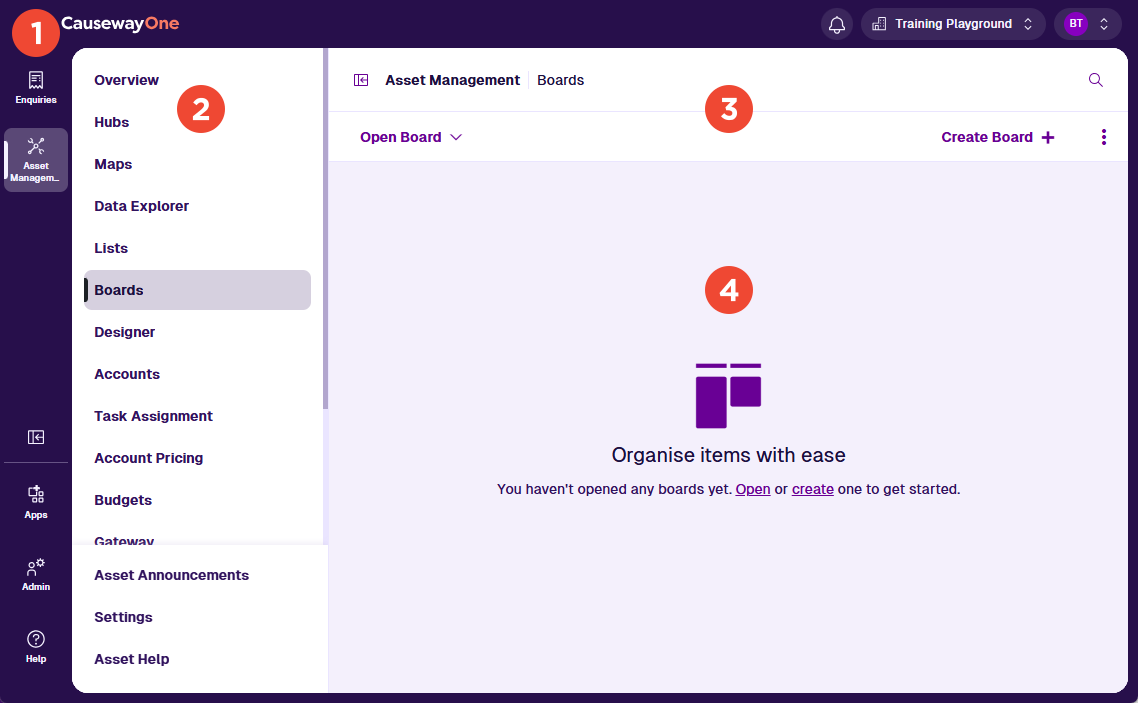
1 CausewayOne sidebar / header
These purple bars let you navigate and control your CausewayOne experience.
Use the sidebar to switch between your workspaces and applications. The Sidebar Toggle button lets you collapse it for extra space. The lower buttons let you discover other CausewayOne applications, administer your company (if you have the role) and get help.
Use the top header to access your notifications, switch companies (if you belong to several) and configure your account profile. Each CausewayOne company has its own self-contained database for storing designs, items, layers and other Asset Management data.
To learn more, see the CausewayOne Documentation.
2 Left panel
Use the left panel to navigate Asset Management:
-
Overview - access your personalised grid of apps and classic features.
-
Shortcuts to apps (such as Data Explorer, Maps and Boards) and classic features (such as Gateway and Workflows). If a shortcut appears dimmed, it may not be enabled for you or your company.
-
Asset Classic - access the classic workspace within CausewayOne.
-
Asset Announcements - stay informed about changes to Asset Management. View release notes, notices and other important updates.
-
Settings - customise your experience:
-
Default app - automatically open the chosen app when you start Asset Management. If blank, the Overview appears by default.
-
Default item (varies by app) - automatically open the chosen item when the default app opens.
-
-
Asset Help - learn what Asset Management can do and how to use it effectively. To raise a help request, select Help in the CausewayOne sidebar.
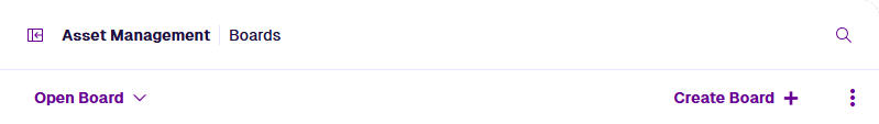
3 App bar
Use the white app bar to perform the following actions:
-
Panel Toggle - hide the left panel for extra space.
-
Search - search your Asset Management data. Open items and features that you use regularly.
When you open an app, the app bar displays a second row of context-sensitive actions, such as Open and Create. Select the Menu button for more actions. Each app guide documents the available actions and what they do.
4 App area
This area displays the content of whatever is currently selected in the left panel. If Asset Classic or a classic feature is selected, the classic workspace is loaded in this area.
Browser navigation
Use your browser's Back and Forward buttons to move through the sequence of apps, features and items you've opened.
Multitasking
Use multiple browser tabs to multitask. Most links in CausewayOne can be opened in a new tab using right-click, middle-click or Ctrl-click. You can also right-click the current tab and choose Duplicate or similar.
For example, imagine you're creating an item. As you populate its attribute fields, you realise a value is missing from a lookup list. By opening another browser tab, you can resolve this issue without interrupting the current process.
Share and bookmark links
The URL in your browser's address bar changes when you open apps, features and items. Use your browser bookmarks to save your current place or create specific shortcuts. You can also share links with other Asset Management users (provided they have permission to view what it links to).