Edit a layer style
Change the properties of a layer style
You can edit any custom layer style added by your organisation. If the Context of a layer style is not Customer, it's a protected system style. This means its query can't be changed, though you can still edit its appearance and behaviour.
To edit a layer style:
-
Select Layers in the right toolbar, select the layer, and then select the layer style.
-
Select Edit in the relevant section and make your changes.
-
Select Save to finish or to cancel.
Layer style properties are organised into the following sections.
To return to the layer, select its name in the style's header, or use your browser's Back button.
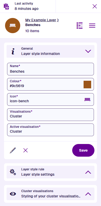
General
This section contains the layer style's main properties:
-
Name * - enter a distinct name that clearly identifies the layer style.
-
Colour * - use the colour picker to set the colour of all items displayed by the layer style.
-
Icon * - use the icon picker to set the icon of all items displayed by the layer style.
-
Visualisations * - select one or more possible visualisations for the layer style, depending on its type:
Design (AQS)
Design layer styles can use the following:
-
Cluster (default) - nearby items are grouped into numbered clusters when zoomed out far enough, to avoid cluttering the map. Select a cluster to zoom into it and see its individual items.
-
Network - intended for network layers displaying items with line geometry. Items initially appear more simplified and can't be selected until you zoom in close enough. To learn more, see Networks in Asset Classic.
-
Basic - items are always rendered as individual icons, regardless of zoom level. To ensure safe performance, this visualisation is limited to 500 items. If the layer style exceeds this limit, it will fail to build.
WFS
WFS layer styles can use the following:
- WFS - enables the display of custom title/subtitles. Items are always rendered as individual icons, regardless of zoom level.
-
-
Active visualisation * - apply one of the possible visualisations to the layer style.
Layer style rule
This section contains the properties of the layer style's data source.
Design (AQS)
Design layer styles have the following property:
- Query - use the AQS Builder to modify the query that fetches items to be displayed. This lets you do things like add more conditions, switch collections, or change the target design/interface.
WFS
WFS layer styles have the following properties:
- URL * - update the URL of the WFS service.
- ESPG Code * - the coordinate system used to plot the chosen feature's geometry. If undetected, it will default to 4326, which is the WGS84 Lat/Lng system used internally throughout CausewayOne Asset Management (view on epsg.io).
- WFS Feature Type * - choose one of the available feature datasets provided by the service.
-
Output Format - choose the data format of the chosen feature. If you're unsure, experiment and use the preview button until the expected data appears:
-
GML 3
-
GML 2
-
JSON (default)
-
ESRIJSON
-
KML
-
-
Load All Items Strategy - if enabled, all available data items will be loaded at once. Otherwise, only the data items located within the visible map area will be loaded.
- Version - the version of the WFS protocol used by the service.
Visualisations
A section is displayed for each possible visualisation. Each section contains properties that control the visualisation's appearance.
Cluster visualisations
-
Scale - control the size of item icons and the thickness of line geometry.
-
Show icons - if disabled, items will appear as empty coloured circles.
-
Alpha - control the transparency of items by setting a value between
1(opaque) and0.001(almost invisible). If left blank, a value of1will be used.
-
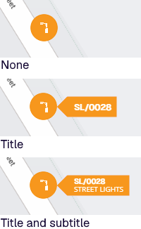
Label mode - display a label for each item containing its Title or Title and subtitle. If left blank, a value of None will be used.
-
Centroids only - depending on the zoom level, an item with big line/polygon geometry may overlap multiple cluster regions. By default, the single item will be counted multiple times. If this is enabled, the item will only be counted in a single cluster that overlaps the item's central point.
Network and Basic visualisations
-
Scale - control the size of item icons and the thickness of line geometry.
-
Show icons - if disabled, items will appear as empty coloured circles.
-
Alpha - control the transparency of items by setting a value between
1(opaque) and0.001(almost invisible). If left blank, a value of1will be used.
-
Label mode - display a label for each item containing its Title or Title and subtitle. If left blank, a value of None will be used.
WFS visualisations
-
Title / Subtitle - select either field and choose a variable in the feature dataset to display that data within each item's label. If Title is left blank, no label will be shown.
-
Scale - control the size of item icons and the thickness of line geometry.
-
Show icons - if disabled, items will appear as empty coloured circles.
-
Alpha - control the transparency of items by setting a value between
1(opaque) and0.001(almost invisible). If left blank, a value of1will be used.