Open an item
View an item's details
As you navigate around the map, you'll see points, lines and polygons displayed at various locations, on top of the basemap imagery. These represent the items in your customer project!
For items to appear on the map:
-
they must have geometry
-
you must turn on at least one layer style that either targets their design or an implemented interface
-
you must have permission to view their design
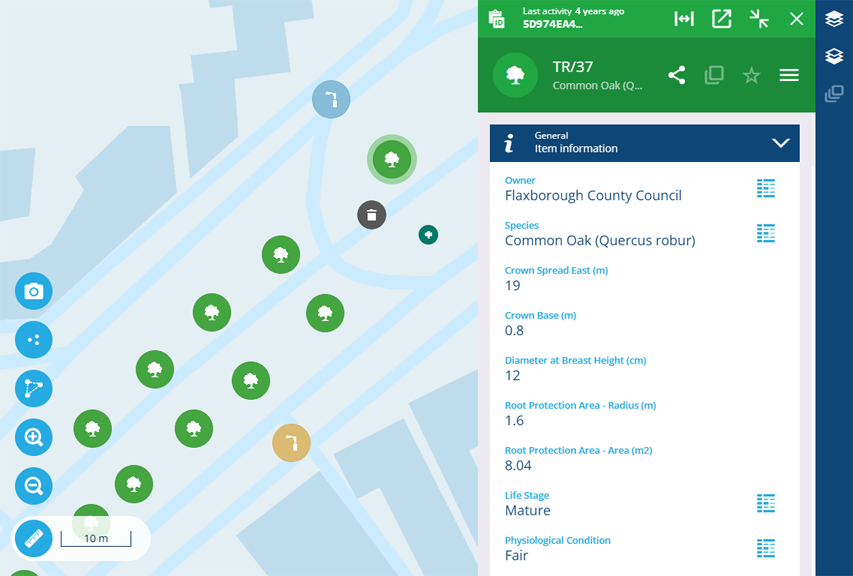
Select an item to view its details in a resizeable side panel, without interrupting what you're doing.
Clustered items
By default, layer styles have their Active visualisation set to Cluster.
When items in these layer styles get too close, Alloy clusters them together into a single icon for neatness. The further out you zoom the map, the more items become clustered together. The number inside the icon represents the number of clustered items.
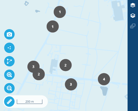
Select a cluster to zoom into its location. The cluster will separate into smaller clusters or individual items, which you can then select to view their details.
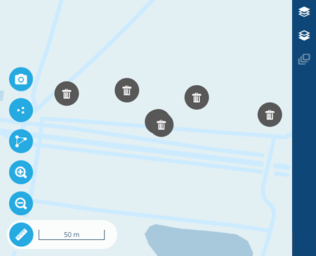
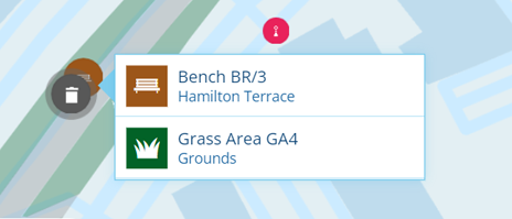
Overlapping items
It's possible for multiple items to occupy the same location on the map, e.g. an asset with multiple defects, jobs or inspections registered against it. When this happens, you can only see the topmost icon. If you select it, that item's details will appear in the side panel.
However, any other items at that location will also be listed (subject to layer visibility). Select one to view its details. If there are more than five, scroll the list to see the rest.
Moving the mouse cursor over an item with polygon geometry will highlight it, obscuring any items underneath. To prevent this, hold the Alt key as you move the cursor.

Item panel controls
When viewing an item's details in the side panel, extra controls appear along the top of the coloured item header.
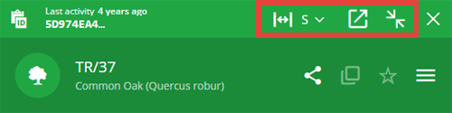
Use these controls to resize and minimise the item panel:
-
Container width - make the item panel narrower or wider. Choose a size and the item's canvas layout will adjust itself accordingly. Alternatively, select anywhere within the panel and press a number key from 1 and 5 to switch sizes.
-
Open in new tab - open the item in a new browser tab, where you can view its details at full size.
-
Minimise - hide the item panel without closing it, so it doesn't cover the app. To show the item panel again, select in the top-right corner. To close it, select .
