Permissions Explorer
Control access to data and features
The Permissions Explorer lets admins control what groups can see and do across CausewayOne Asset Management. Use it to:
-
manage roles and groups
-
select a group and configure its permissions across various categories
-
see how roles, groups and category objects relate to each other
To get started, select Permissions on the start screen.
Key features
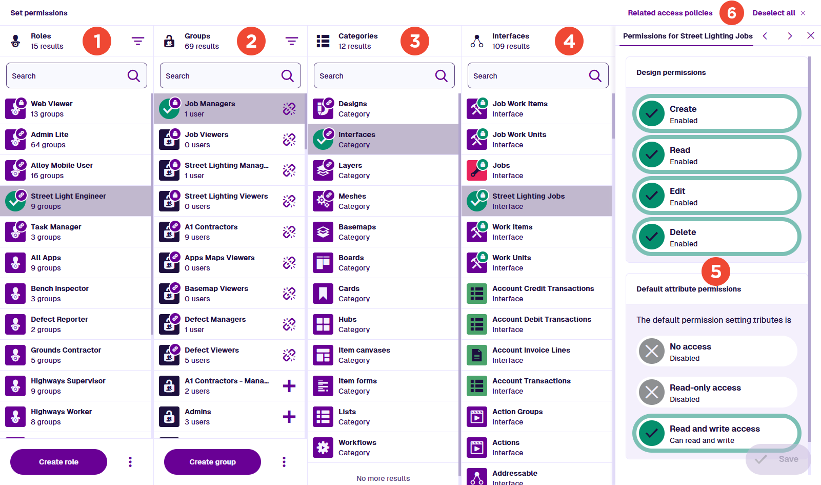
The Permissions Explorer is organised into columns.
1 Roles
The roles in your company project. A role is a bundle of groups that provides a combined set of permissions.
Roles let you define access by position, persona or responsibility. This is simpler than adding a user to multiple groups. Future maintenance is also easier, as adding or updating groups will affect all users with the role.
When permissions are combined, the highest level on each category object wins. Access is cumulative; a lower level can't remove access that a higher one grants, e.g. Group A (No access) + Group B (Read-only) = Role AB (Read-only).
Select a role to highlight the groups it contains and the categories they configure. With no group selected, select a highlighted category to view the winning permissions inherited by the role.
To learn more, see Manage roles and groups.
For example, a Highways Inspector role could include the Carriageway Viewers, Defect Managers and Mobile Users groups.
2 Groups
The groups in your company project. A group is a set of permissions for specific objects in various categories.
Where possible, keep each group small and focused on one set of related permissions. Narrow groups are easier to understand, reuse across roles, and audit when access needs to change.
Select a group to highlight the roles it belongs to and the categories it configures. Select a category and then an object to open its permissions.
To learn more, see Manage roles and groups.
For example, a Carriageway Viewers group could grant read access to the Carriageways design, along with related layers, lists and hubs.
3 Categories
Your Asset Management features are organised into categories. Each category contains objects that you can control access to.
Select a category to list its objects in the next column.
List of categories
| Icon | Category | What it controls access to | Permission style |
|---|---|---|---|
| Designs | Items of specific designs and their attributes | Granular | |
| Interfaces | Items of designs that implement specific interfaces and inherit permissions | Granular | |
| Layers | Map data layers | 3-level | |
| Basemaps | Map background imagery | 3-level | |
| Boards | Kanban boards for tracking item status/progress | 3-level | |
| Hubs | Data dashboards with item counts and graphs | 3-level | |
| Item canvases | Item section layouts | 3-level | |
| Item forms | Item attribute layouts | 3-level | |
| Lists | Dynamic item lists | 3-level | |
| Meshes | 3rd party integrations included with modules | 3-level | |
| Workflows | Automated action sequences | 3-level |
4 Objects
This column appears when a category is selected. It lists the corresponding objects in your company project. To filter the list, use the top search box.
Select an object to highlight groups with permissions configured for it (and the roles containing them).
With a role or group selected, each of its configured objects is highlighted with a coloured lock badge to indicate its permission level. Select an object to open its permissions in the Permissions panel.
5 Permissions panel
This panel appears when a role/group and object are both selected:
-
With only a role selected, the panel is read-only and shows the combined permissions inherited from its groups.
-
With a group selected, the panel is editable and shows that group's permissions.
The options in the panel depend on the selected category:
-
Most categories have three levels: No access, Read-only or Read and write. See Set permissions.
-
Designs and interfaces have more granular permissions: Create, Read, Edit and Delete. Individual attributes are also configurable. See Set DoDI permissions.
Select Save at the bottom to finish.
If a role or system group is selected, this panel is read-only and its controls are disabled.
6 App bar
The following actions are available in the app bar:
-
Related access policies - with a group, design or interface selected, list any access policies targeting the current selection. If both a group and design/interface are selected, only policies that target both are shown. Select a policy to open it.
-
Deselect all - clear your current selections across all columns.
Navigation
Select up to one thing in each column:
-
Role <-> Group - select a role to manage its groups, or a group to see its linked roles.
-
Role -> Category -> Object - view the combined permissions inherited by the role from its groups (read-only).
-
(Role ->) Group -> Category -> Object - view and configure the group's permissions.
-
Category -> Object - highlight groups with permissions configured for the object (and the roles containing them).
To start over, select Deselect all.
Connections
When you select something, related things in other columns are raised and highlighted with badges:
-
Link badge - this role contains the selected group, this group belongs to the selected role, or this category contains an object the selected group/role has permissions for.
-
Lock badge (purple) - this role or group contains permissions for the selected object.
-
Lock badge (coloured) - this object has permissions configured for the selected group. The colour indicates the level: red for No access, yellow for Read-only, green for Read and write.