Widgets
Create spaces for data points
When editing a workspace, you can configure its widgets to display data that's useful and relevant to the intended audience. This could be a particular team, job role, or just for you!
A widget can have any number of data point queries. For each data point, the widget displays the item count and the location of those items within an optional map area, and provides a convenient way to open those items within a compatible Alloy app.
If a data point query fails, it will display a button. Select it for more details.
Add a widget
You can add any number of widgets to a workspace. Select Add widget in the toolbar, or select beside the last widget, and then choose a widget type.
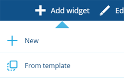
New
To create a new widget from scratch, choose New. Fill in the following fields as needed:
-
Type * - choose one of the following:
-
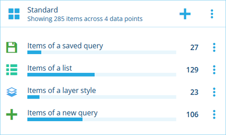
Standard - the widget can display data points added from various sources.
-
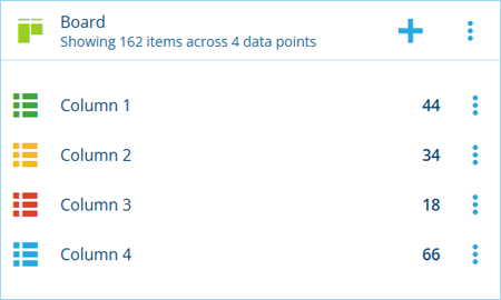
Board - the widget can display data points representing the columns of a board created with the Boards app. The widget's name, icon and colour will be populated automatically with the board's values (but can still be changed).
-
-
Name * - enter a distinct name that clearly identifies the data displayed by the widget.
-
Icon * - use the icon picker to change the icon in the widget's header.
-
Colour * - use the colour picker to change the colour of the icon in the widget's header.
-
Show percentage bars - if enabled, each data point will display a filled bar to indicate its item count as a percentage of the widget's total.
-
Default App - when a data point is selected, open its items in the specified Alloy app. If left blank, each data point will open in the most suitable app for its type.
-
Show map - display an interactive map area in the widget:
-
Basemap * - customise the map's appearance with the chosen basemap imagery.
-
Layers - to display other sets of items on the map, select one or more layer styles from the list.
-
Define bounding box - use the Geometry Editor to draw a box to define the initial area displayed by the map. This ensures that the widget is always focused on what's important when the workspace is opened. Users can then zoom and pan around as needed.
-
Select Save to finish.
From template
To create a widget based on an existing template, choose From template and then choose one from the list. Some of the available templates may have been created by your organisation. Others may be included with optional modules that were installed for your customer project.
A widget will be added to the workspace with the same configuration as the chosen template. To edit the new widget's properties, select its button and choose Edit. Any changes you make are saved to the copy, not the original template! This makes it easy to reuse established sets of data points across multiple workspaces.
Widget actions
To perform an action with a widget, select the button in its header:
-
Edit - change the widget's name, appearance and other properties.
-
Percentage bars - if enabled, each data point will display a filled bar to indicate its item count as a percentage of the widget's total.
-
Make template - save the widget's current configuration as a template item, so it can be easily reused in future.
-
Archive - remove the widget from active service.
-
Unarchive - if the widget is archived, restore it to active service.
-
Delete - if the widget is archived, remove it permanently, along with any highlights that reference it.
-