Editing item forms
How to edit an item form
Once an item form is created, you can use the Item Form Builder to add controls and configure their properties.
To edit an item form:
-
Open the Designer dashboard card and choose Item forms.
-
Select the relevant item form in the search results in the right panel.
-
Select More in the action bar and choose Open item form builder.
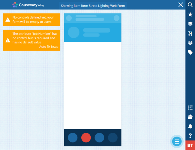
A newly created item form will be empty and contain no controls (indicated by an orange warning).
What are controls?
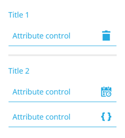
Controls are the building blocks of your item form. There are two types:
-
Attribute control - an input field for setting the value of an attribute on the item being created/edited.
-
Other controls - cosmetic elements to give your item form structure:
-
Separator - break up your item form into sections.
-
Title - label the sections in your item form.
-
Labels - display different types of read-only data in your item form.
-
For a full list of controls and what they do, see Item form controls.
Add controls
Attributes
To add an attribute control to your item form:
-
Select Menu (bottom-right) and choose Add attribute.
-
Choose an attribute from the list. If an attribute appears dimmed, the item form already has a control for it.
-
Choose a control type. Only those relevant to the chosen attribute will be listed.
To add controls for all attributes on the design/interface, select Menu (bottom-right) and choose Add all default controls.
An item form must include controls for attributes that are Required by the item's design/interface with no default value set. If you see a warning about this, select Auto fix issue to add the default control type for that attribute type.
Other
To add other control types:
-
Select Menu (bottom-right) and choose Add control.
-
Choose Separator, Title or one of the Label controls.
Control properties
The properties of a control resemble the properties of the attribute it represents. This enables you to override the attribute's properties when needed, to suit different item forms.
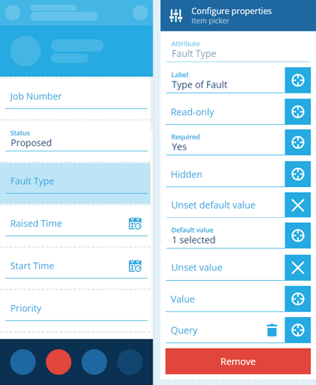
Select a control to view its properties:
-
Label - set a display name for the control. Otherwise, the attribute's name will be used.
-
Read-only - the control won't be editable. It can only be populated with a default value (set by the control or the attribute itself).
-
Required - the control must have a value set. It won't be possible to leave it blank!
-
Hidden - the control won't be visible. However, it can still be populated by a default value (set by the control or the attribute itself), or the output of a targeted expression.
If the attribute itself is Read-only or Required by the item's design/interface, this can't be overridden by an item form. You can make a writeable attribute read-only, or an optional attribute required, but not vice versa!
-
Unset default value - if the attribute itself has a default value (defined by the item's design/interface), it will be ignored.
or
-
Default value - the control will automatically be populated with this, unless another value is set (by a user or a targeted expression). If the attribute itself has a default value, this will override it.
-
Unset Value - clears the current value when triggered by a targeted expression. If set here, the control is guaranteed to be empty initally.
or
-
Value - the control will initially be populated with this (overriding any default value). But unlike a default value, the control won't be repopulated with this if left blank.
-
Query - this only appears for Link attributes. It lets you customise the attribute's lookup list on the form. Use the AQS Builder to define one or more conditions that items must fulfil to be included in the list. To sort the listed items by an attribute or property, select the query root node.
Default AQS parameters
In this scenario, the AQS Builder provides two default parameters. A parameter is a placeholder that is substituted with a value when the query runs. If you include a parameter in your query, it becomes dynamic and can produce different results depending on the context:
-
Current item ID - represents the ID of the item being viewed or edited. It can be used to fetch items related specifically to that item, enabling fields on the form to display context-sensitive lookup results.
-
Current user ID - represents the ID of the user who is creating, editing or viewing the item. It can be used to fetch items related specifically to that user.
To learn more, see AQS parameters.
-
Target an expression
For advanced customisation, the properties of a control can be set dynamically, based on the output of an expression. To learn more, see Item form expressions.
To make a property target an expression, select the property's icon and choose an available expression from the list.
Arrange and remove controls
Drag a control to move it up or down the item form.
To remove a control, select it, and then select its red Remove button. To remove them all, select Menu (bottom-right) and choose Clear controls.
Save your changes
To save any changes to the item form, select Menu (bottom-right) and choose Save Item form.
We recommend testing an item form's functionality before making it available to users!