Item form controls
Build your item form with controls
Controls are the building blocks of your item form. They let users view and edit data on the item being created/edited.
When editing an item form, you can add controls via the Menu button (bottom-right).
Attribute controls
Add a control for each attribute that you want the user to view or edit (controls can be read-only). Depending on the attribute, there may be several control types to choose from. Select the one that best fits your needs.
Controls appear as a field on the item form. When the user selects it, they can enter a value directly, or select one from a picker.
For Text attributes
| Control type | Attribute type | Description | Preview | Alloy Mobile |
|---|---|---|---|---|
| Collection code picker | Text | User can pick a collection to store as text. | 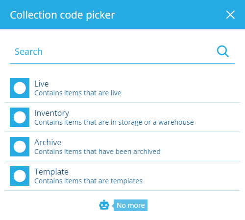 | As a Text input |
| Colour picker | Text | User can pick a colour to store as text (hex code). | 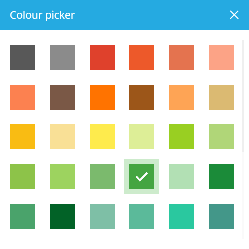 | As a Text input |
| Design or interface picker | Text | User can pick a design or interface to store as text (Guc code). | 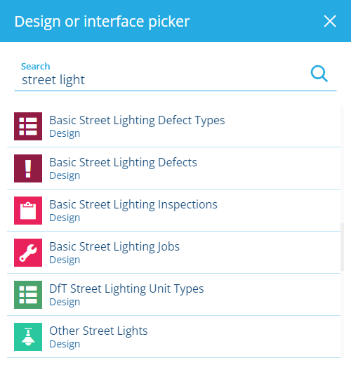 | As a Text input |
| Icon code picker | Text | User can pick an icon to store as text (icon code). | 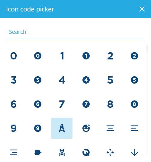 | As a Text input |
| Mesh picker | Text | User can pick a Mesh item to store as text (Guc code). | 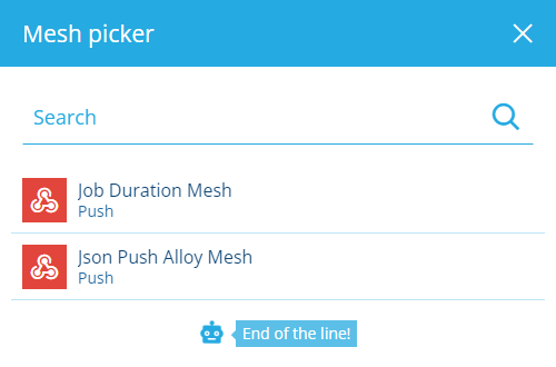 | As a Text input |
| Multiline text input | Text | User can type text with line breaks into a large box. | 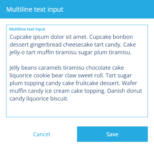 | As a Text input |
| Text input | Text | User can type text into a single line field. |  |
For other attributes
| Control type | Attribute type | Description | Preview | Alloy Mobile |
|---|---|---|---|---|
| AQS editor | AQS | User can build and submit a query with the AQS Builder. |  | |
| Checkbox | Yes/No | User can toggle the attribute between true and false. |  | |
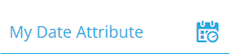
| Date picker | Date | User can pick a date with the calendar picker. | 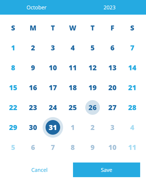 | |
| Date time picker | Date Time | User can pick a date and time with the calendar picker. | 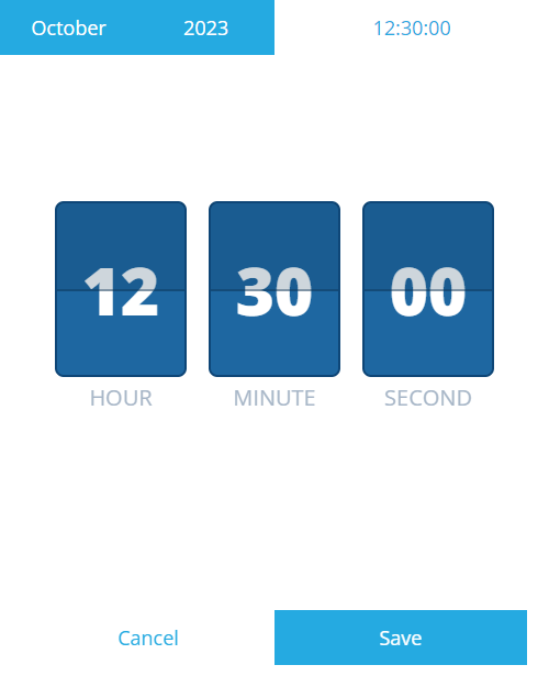 | |
| File picker | Link | User can pick a file stored in CausewayOne Asset Management or upload one directly. | 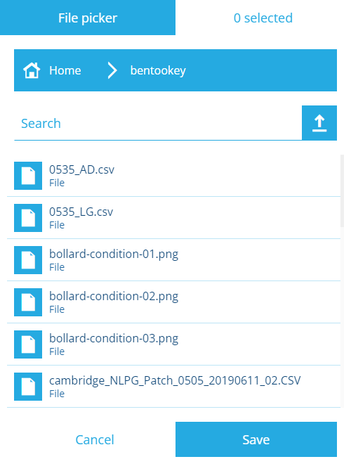 | |
| Geometry editor | Geometry | User can set coordinates with the Geometry Editor. | 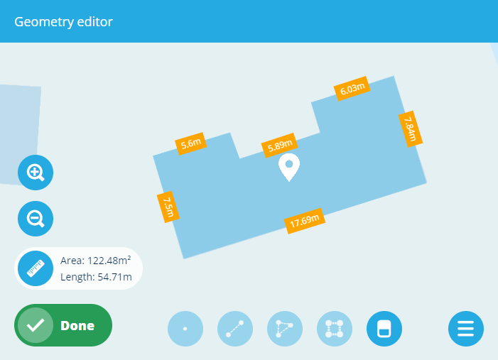 | |
| Item picker | Link | User can pick items from the attribute's lookup list with the item picker. | 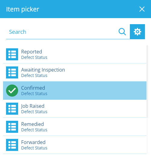 | |
| JSON picker | Json | User can input JSON code. | 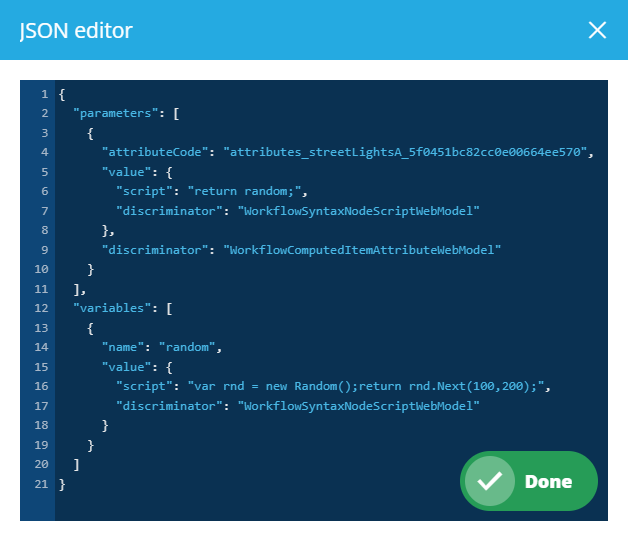 | |
| JSON form editor | Json | User can input or choose values for each property defined by the attribute's schema. |  | |
| Number input | Number | User can type a number into the field. |  | |
| Seasonal picker | Seasonal | User can pick a day of the year with the calendar picker. | 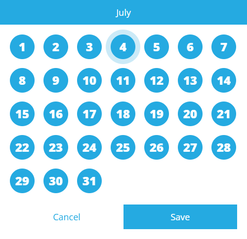 | |
| Time picker | Time | User can pick a time with the calendar picker. | 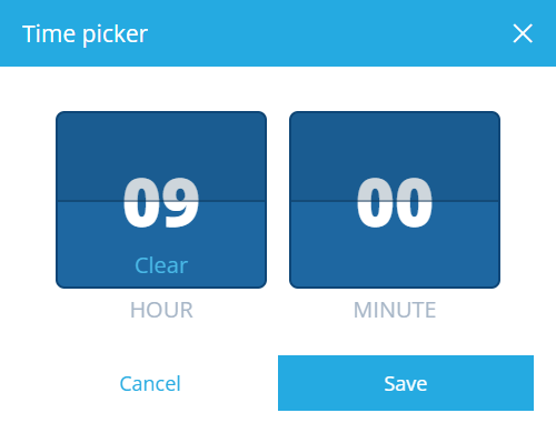 |
Other controls
These controls are cosmetic and useful for structuring your item form:
-
Separator - break up your item form into sections.
-
Title - label the sections in your item form.
-
Labels - display different types of read-only data in your item form. Unlike attribute controls, their values aren't submitted when the form is saved. They can display a static value entered by you, the value of an attribute, or the output of a targeted expression.