Field control
Display a data value
You can add any number of these to the layout of a flow document.
A Field control represents a single labelled data value. It's typically used to display the dynamic value of a header within an AQS, Item or Join data source, e.g. Job Number, Installed Date.
However, you can use it to display constant data sources too!
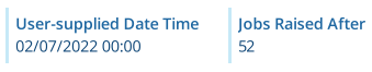
For example, imagine a report about jobs. It contains a Date Time data source for the user to populate when they run the report. This gets used as a parameter in an AQS data source, so that only jobs with a Raised Time greater than the user-supplied date are included. The document layout includes a Field control to display the Date Time data source, so the reader can see what was chosen.
Add a Field control
In the Document Layout Editor, select Add at the bottom (or within a container control) and then choose Field.
Set a value
-
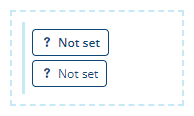
Label - select the first pill shape inside the control.
-
Value - select the second pill shape inside the control.
For each pill shape, you can set a value that's either Static (set by you while editing the layout) or Dynamic (linked to a data source header). To learn more, see Dynamic values.
Configuration
Select the control to show its properties in the toolbar.

Layout properties
-
Relative width - Auto by default. The control automatically sizes itself to display its content in full (space permitting). Alternatively, you can set a constant width. See Flow control width.
-
Margins - adjust the gap between each side of the control and the content inside. See Flow control margins.
Field properties
-
Wrap - enabled by default. If the text content exceeds the maximum width of the control, it'll be wrapped onto multiple lines. If disabled, the control will display a single line of truncated text.
-
Header type - if a dynamic Label has been set, this determines what will be used:
-
Id - the attribute code of the selected data source header, e.g. attributes_assetsInstalledDate
-
Name (default) - the name of the selected data source header, e.g. Installed Date.
-
-
Edit description - customise the control's description (shown in the toolbar).
-
Remove - delete the control.