Map control
Display geometry on a Google Map
You can add any number of these to the layout of a flow document.
A Map control represents geometry data displayed on a Google Maps basemap. It's typically used to visualise the Geometry attribute of one or more items fetched by an AQS, Item or Join data source.
However, you can use it to display constant data sources too!
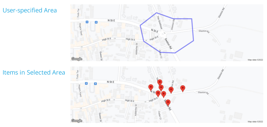
For example, imagine a report about assets in a defined area. It contains a Geometry data source for the user to specify the area when they run the report. This gets used as a parameter in an AQS data source, so that only assets within the user-specified area are included. The document layout includes two Map controls: one to display the area that the user selected, and one to display the assets within that area.
Add a Map control
In the Document Layout Editor, select Add at the bottom (or within a container control) and then choose Map.
Set a boundary box
To set an optional boundary box, select the pill shape inside the control. This determines the displayed map area, independently of whatever items are shown from the data source. To learn more, see Defining a bounding box.
Configuration
Select the control to show its properties in the toolbar.
Layout properties
-
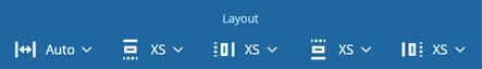
Relative width - Auto by default. The control automatically sizes itself to display its content in full (space permitting). Alternatively, you can set a constant width. See Flow control width.
-
Margins - adjust the gap between each side of the control and the content inside. See Flow control margins.
Map properties
-
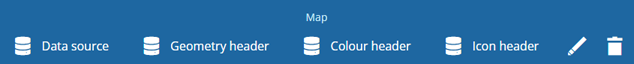
Data source - choose the data source that the control will fetch data from.
-
Geometry header - choose the header in the selected data source that contains the geometry data you want to display.
-
Colour header - optionally, choose a header in the selected data source that contains a colour code.
-
Icon header - optionally, choose a header in the selected data source that contains an icon code.
-
Edit description - customise the control's description (shown in the toolbar).
-
Remove - delete the control.